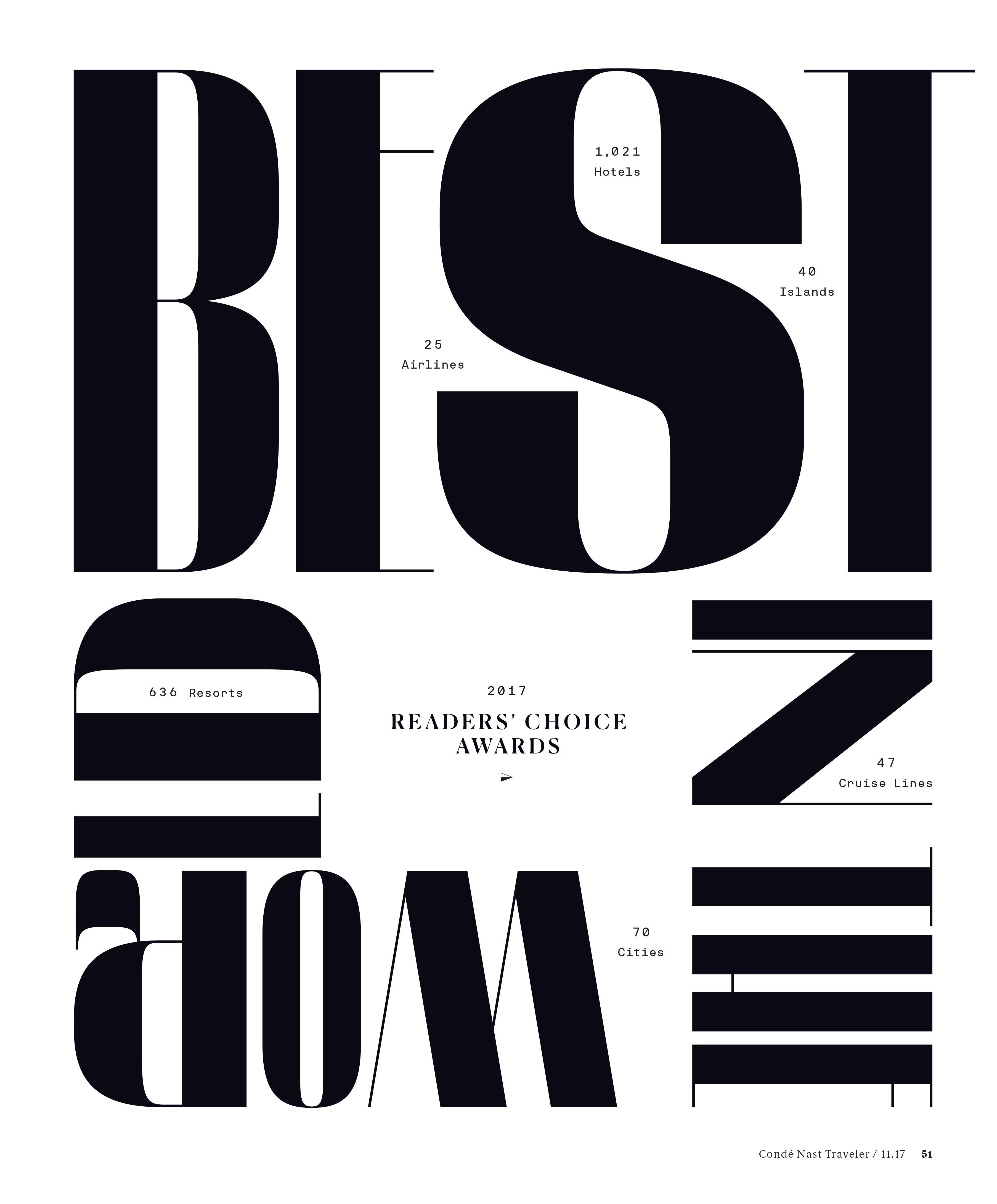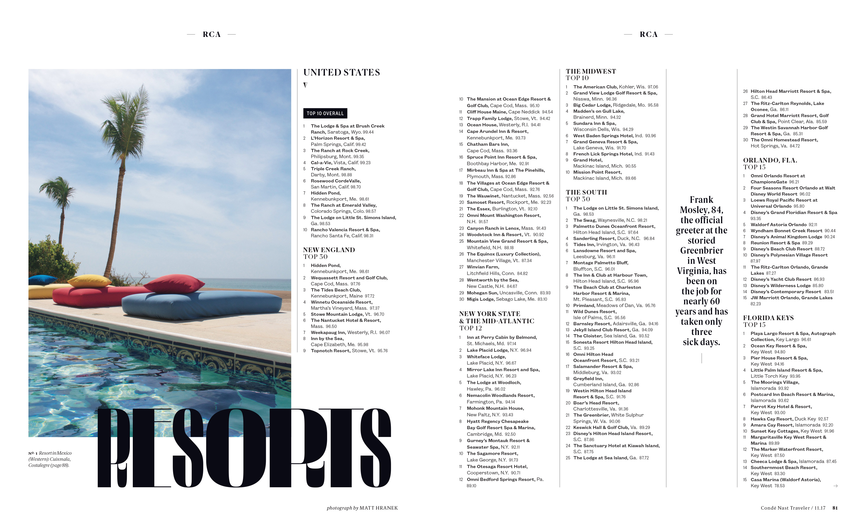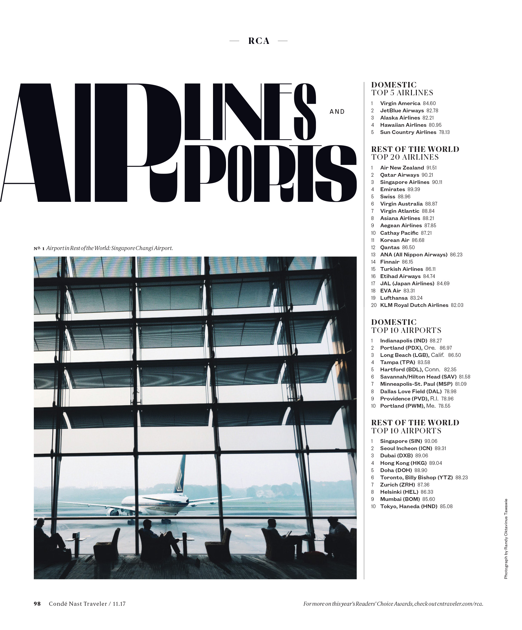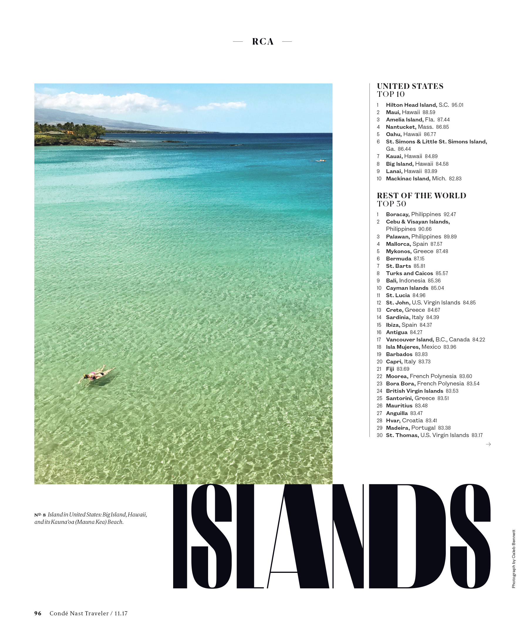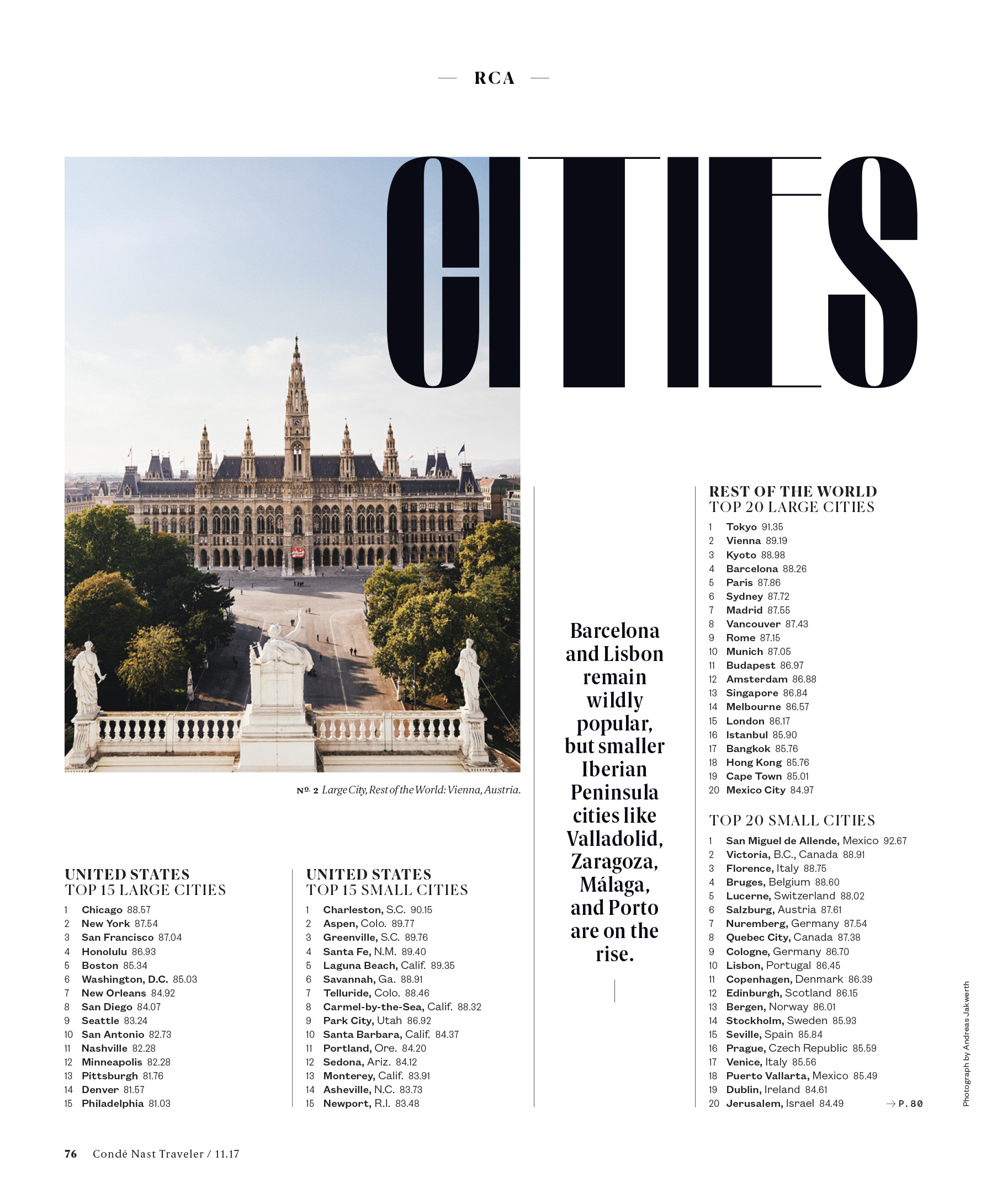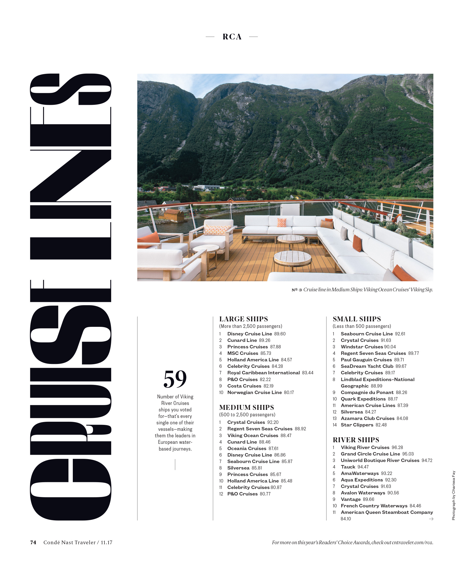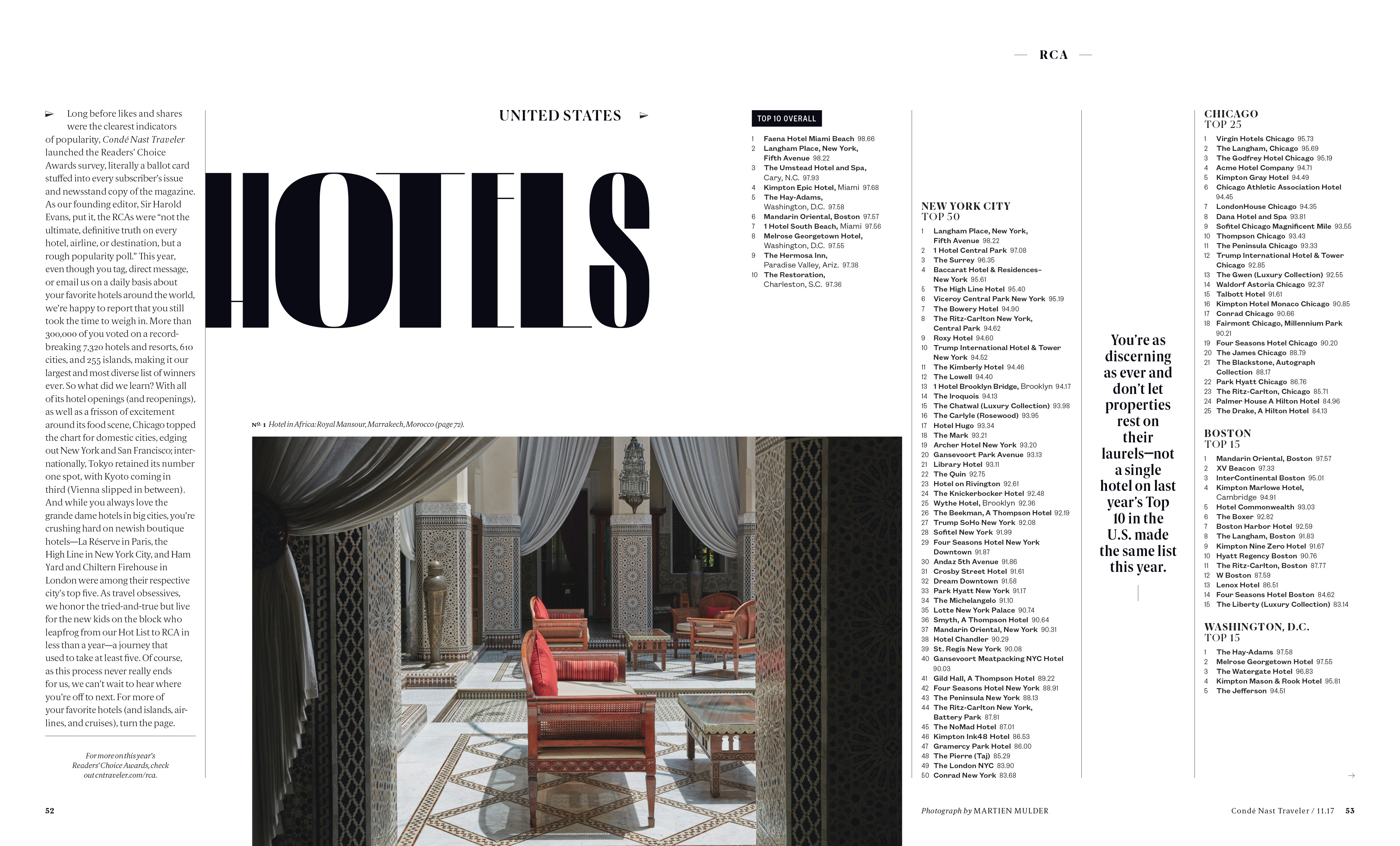

Caleb Bennett showed me a photo of another hand painted sign he saw in Mexico and asked if I could make him a typeface based on it. I did, but the typeface wasn’t very good. We liked the structure, but trying to imitate the organic details of the original created something from the uncanny valley. We decided to retain the underlying structure of the original but render it hyper elegantly with very delicate hairlines. I gave Caleb a range of widths and optical sizes and he used them in beautiful ways that I never could have imagined.
Design Director: Caleb Bennett
