
This was a project like none other — moving so fast that we didn't even know the final language of the logo until the brand launch itself when Tim Walz was announced as the VP pick. And Tal was like a deus ex machina — arriving at the perfect moment with his eagle eyes, exquisite attention to detail, speed, discretion, and generosity. His improvements to the logo (and more generally with Balto) were subtle but absolutely critical to conveying the strength and polish of this unprecedented campaign. — Ben Ostrower, Founder + Executive Creative Director, Wide Eye
I am deeply appreciative of the care, passion, and collaborative spirit that Tal brought to our (very quick) work together one Wednesday in August. His contributions perfectly balanced respecting the original vision and intention of the mark with smart and subtle adjustments to make it just that much more legible, crisp, and hopeful in the countless places it showed up. — Alayna Citrin, Associate Creative Director, Wide Eye


On the morning of August 6, 2024 my friend Christian Schwartz texted me to ask how long I had known that the Harris Walz campaign was going to use my typeface Balto. I told him that I had no idea what he was talking about other than that Vice-President Harris had just announced that Governor Walz would be her running mate. Christian said, “Check the site.” I did and there was Balto. I stared in silence for 10 minutes and then texted the news to my mom and my wife. I had to put my head down on my desk because I was so overwhelmed by the idea that my typeface was part of a campaign that I so deeply supported. After a while I remembered that my friend Scott Dadich hosted a fundraiser for Vice-President Harris many years ago and that he liked Balto. So, I texted him something along the lines of, “Small world. The Harris Walz campaign is using Balto.” Scott sent some very excited texts back. Then, he said, “What do you think of the logo?”
Okay. So. In my personal life I frequently get asked "Do you like Some Company’s new logo?” I have a standard response:
I don’t have an opinion because I don’t know the client’s goals or the designer’s constraints. It’s very easy to quickly pass judgement on aesthetics alone, but I think that is disrespectful to the designer and the work. I have frequently been the designer of a logo being discussed by People On The Internet and it is always a very frustrating experience. Logos have jobs to do that are often more important than just looking nice. Discussing a logo without knowing the broader brief of the project is futile. So, what do I think of that new logo? It’s fine. Would I have done the same thing? No. I would have made something different but that doesn’t mean mine would be better.
Scott and I have designed many logos together, so I didn’t have to tell him this whole thing and I just said, “You know how I feel. It’s fine.” Then he said something like, “Yes, but I want to know your professional opinion. Should WALZ be wider?” If anyone asks me about the mechanics of a logo, well, they will be sorry that they asked. Switching from personal to professional eyes, I said, yeah, it could be wider. Then I rattled off a bunch of other potential enhancements. Scott responded with, “Got it. Can you draw that? I might be able to get it to the campaign.” I started drawing more intensely and more quickly than I ever had before. I checked in with Scott every 30 minutes until we were satisfied (and I was completely exhausted). It was very late at night. Scott sent the result to someone he knew. I thought that would be the end of it.
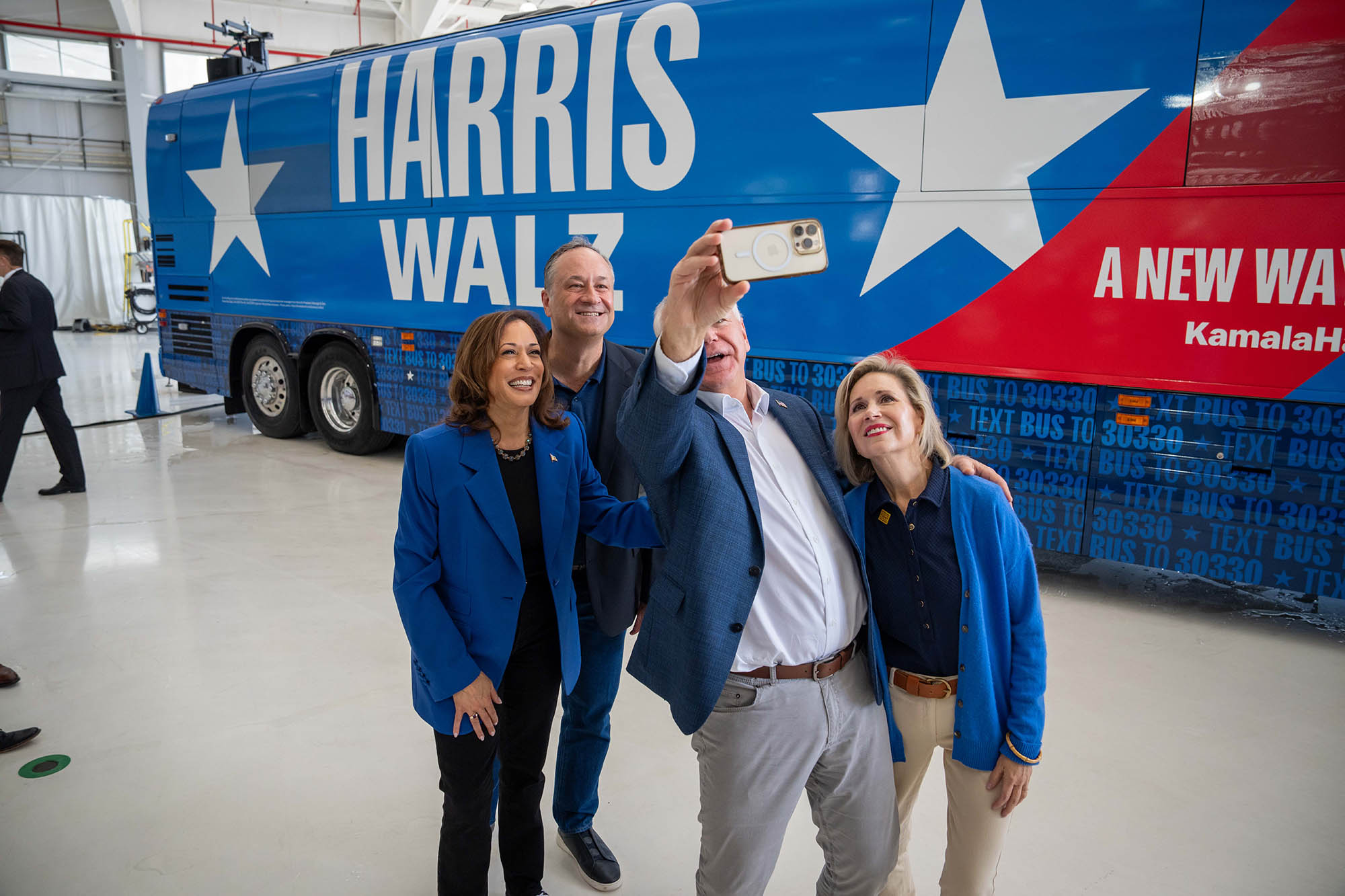
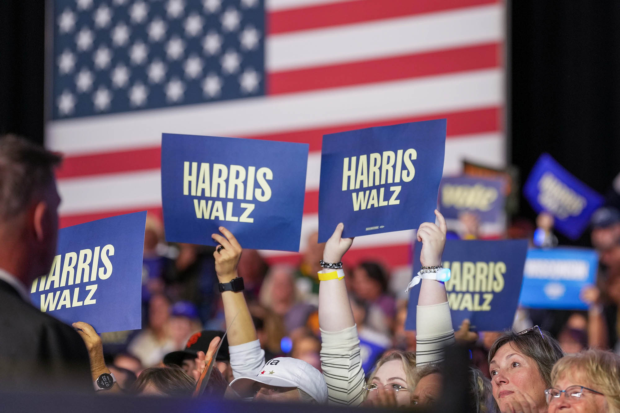
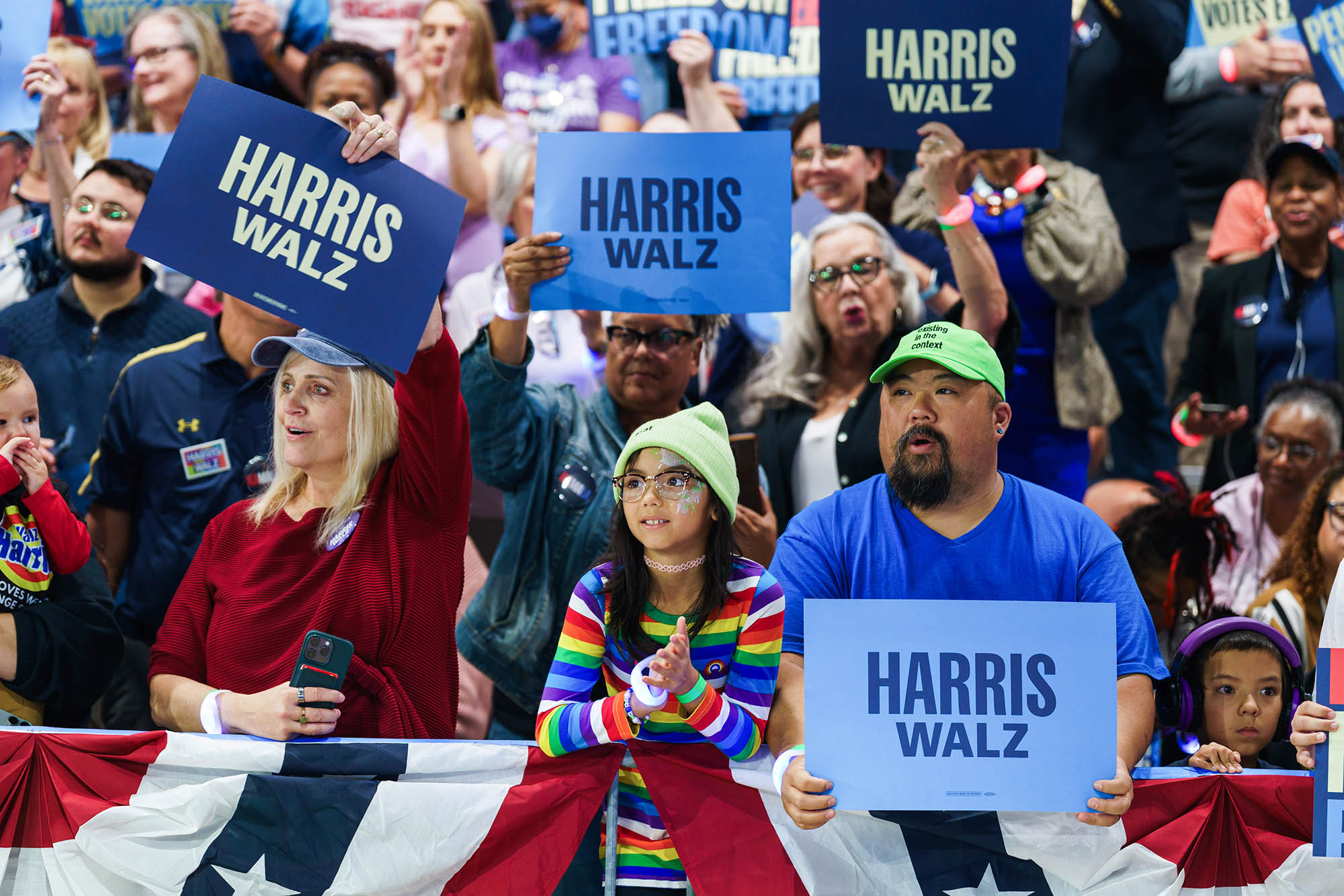
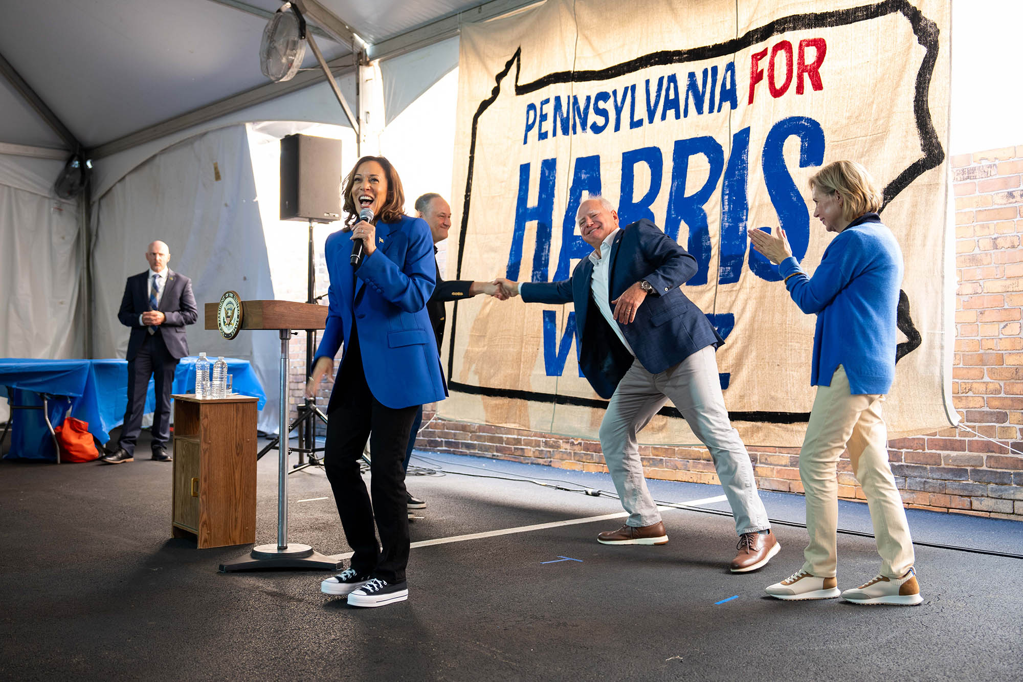
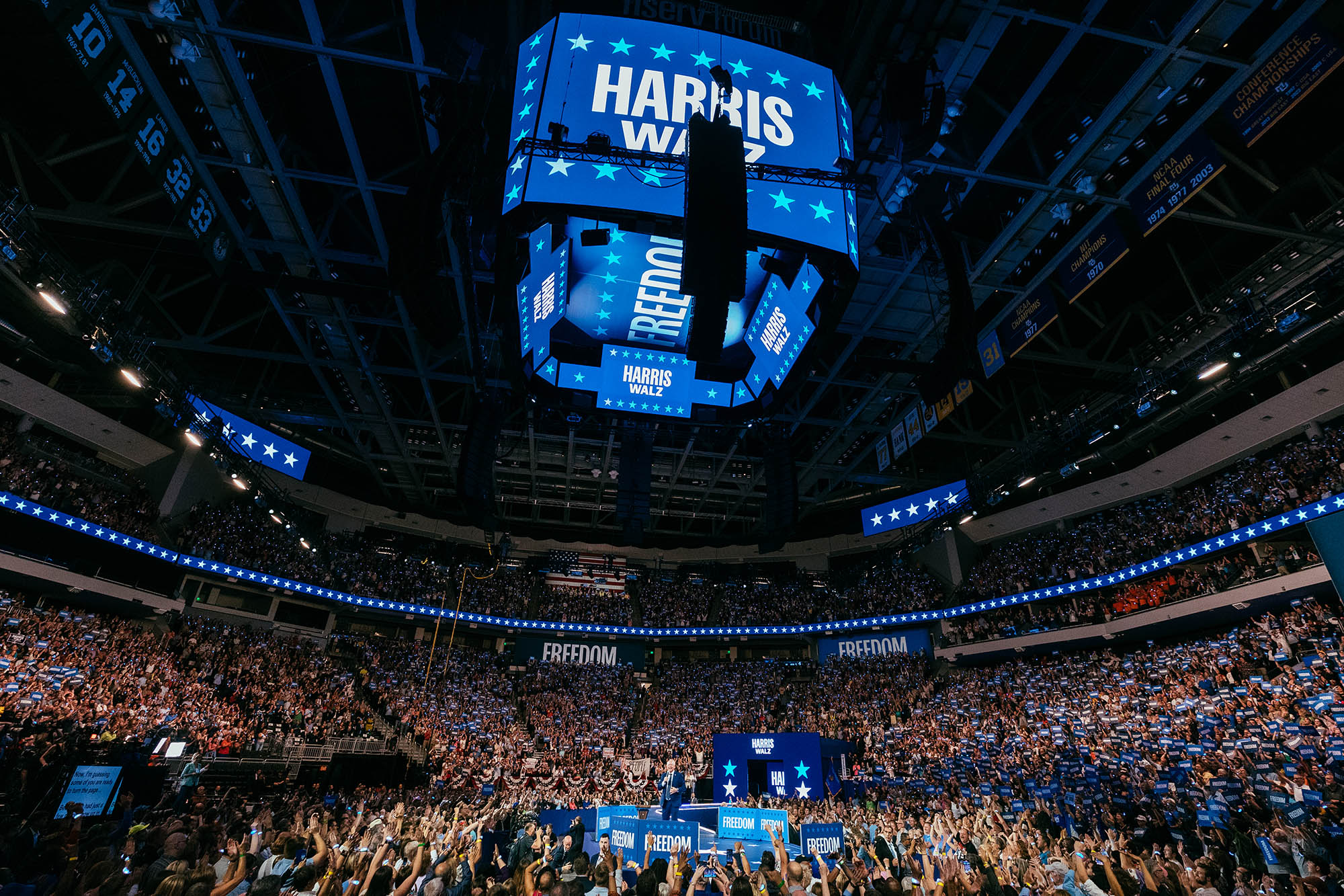
The next morning, my phone blew up. Our work had made it to Wide Eye, the fantastic agency that had developed the Harris Walz identity. Ben Ostrower there said they wanted to talk to me. Now. I jumped on a call with Alayna Citrin and apologized for being That Guy who obnoxiously opined about Wide Eye’s work without knowing the brief. She was incredibly kind and told me the full story of the logo: The logo was designed by Grace Abe, Design Director at Wide Eye, as part of an unprecedentedly fast identity development process. The Wide Eye team designed multiple logos and, because they didn’t know who the running mate would be, they had to design multiple versions of each proposal. On top of that, they had to keep everything as simple as possible because it had to just work because there was no time for mistakes. Then, she blew my mind by saying that they wanted to use the logo that I had drawn the night before. They just wanted to see some small tweaks on the proportions of the names. I made the changes and sent them to her and Ben. That afternoon, the campaign approved it and started rolling it out. We all informally agreed to keep our role in this quiet until after the election. The logo change was eventually noticed by the design community and was discussed at length. I stayed out of those discussions to honor my promise to the campaign, but, for posterity’s sake, here’s what I did and why I did it…
When I started, I only had a PNG from the campaign’s website as reference. After reviewing that my main comments to Scott were:
These notes highlight the difference between using existing typefaces to make a logotype versus crafting letters precisely for the specific content of a logotype. Letters in typefaces must work in any combination. Letters in a logotype only have to work in one combination. There is nothing wrong with the letters that the Wide Eye team used to make the logotype. However, they could be improved in subtle ways to improve this particular usage.
I also had some practical notes:
So, that was my brief.

On the left is the original logo. It uses the typeface Fearless by Lift Type for HARRIS and Balto for WALZ. On the right is the final version that I drew. A few of the differences in the two versions of the logo are obvious. Most are very subtle.

WALZ is obviously bigger. Imperceptibly, the L is more narrow to help WALZ optically center more cleanly. The ink traps in the A and R have been visibly minimized. There are a ton of differences.

My biggest goal was to get a steady rhythm in HARRIS. The message of the campaign called for a very consistent cadence and the vertical strokes were my best tool for establishing that. I wanted to get close to the classic “picket fence” style of poster lettering without compromising legibility. I used three tricks:

To further enhance the vertical cadence, I worked on strengthening the horizontal strokes. This may seem counter-intuitive, but it’s true: you can emphasize one thing by doing the opposite. It’s sort of like how adding a tiny bit of salt to a sweet dessert will make the whole dessert taste significantly sweeter. I used two techniques for this:

The last major thing that I investigated was to make the letters feel more like a classic American Gothic. This style of letter has been used in American politics, sports, advertising and pretty much everywhere else since its ancestors landed on the East Coast from England. It is often used these days to connote American nostalgia, yet somehow it never feels dated. I thought that deploying these characteristics would echo many themes of the campaign. Freedom was already in the general area of an American Gothic and Balto is very much one, so I didn’t have to make any drastic changes. The primary change was in the contrast between the thick and thin strokes of the letters. American Gothics have a pronounced contrast that follows a specific pattern. I made many subtle shifts in weight, most noticeably in the A, to emphasize this in the letters.
Obviously, the election didn’t go the way I had hoped it would. Still, I am immensely impressed by the team effort that went into every aspect of the campaign. I will forever be proud of the tiny role that I played.