


Publishers Weekly had been in publication for 152 years before Heather Haggerty and I got involved in redesigning it. During that time, the magazine had gone through numerous redesigns. Heather compiled a comprehensive collection of archival cover designs so that I could see the evolution of the logo in situ.
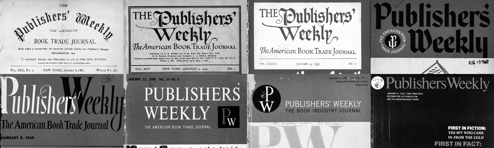
The publication had a serviceable, if not wholly unique, logo from 1872 until the January 4, 1919 issue. The new logo was announced in the publication thusly:
THE COVER We have not lightly made a change from the design that has served on nearly 2500 Weeklies and is so familiar to two generations of the book-trade, yet a simplification of the typography would seem to add dignity and will, perhaps, be more in keeping with what the editors believe to be the thoroly[sic] modern character of the periodical. The new design has been drawn by Frederic W. Goudy. Several slight changes have been made in the text display which should help the appearance and readableness of the pages.
I freaked out a bit when I read this. Frederic W. Goudy was a type design giant! Goudy’s logo remained unchanged until 1942. At that point a more modernized calligraphic logo appeared. (None other than W.A. Dwiggins makes a cameo at this point in a letter to the publication expressing his dislike of the new design.) A further evolved calligraphic logo appeared in 1949 and lasted until 1958 when a stately all uppercase roman took over. At this point, a “PW” monogram was introduced as a secondary branding element. In 1967 George Maas created a new design and the “PW” monogram idea became the primary branding on the cover. Interestingly, he incorporated a small fleuron into the monogram and the magazine was so excited about it that they included a history of typographic fleurons in the debut issue. It starts with:
In PW’s new design, which is primarily functional and is conceived in a contemporary spirit, George Maas has incorporated a single element of decoration—a traditional ornament or printer’s flower, a fleuron—of a kind that has been used by printers since the early days. We use it mainly in the “PW” monogram which appears on the front cover and in several other places all through the magazine. In contrast to the way printers’s ornaments and borders once were used, our employment of the fleuron is sparse. We hope that it will serve to add a gracious note—or call it, per-haps, a grace note—to a working, journalistic design, and at the same time to offer a hint of the typographic heritage. Very similar fleurons are being used in some other contemporary magazines and in some books.
Five years later, in 1972, the magazine was redesigned and the fleuron became a prominent, standalone element on the cover with a stately rendering of “Publishers Weekly” (no apostrophe) in roman title case. The fleuron was dropped at some point in the late 1980s as the publication entered the digital production era.
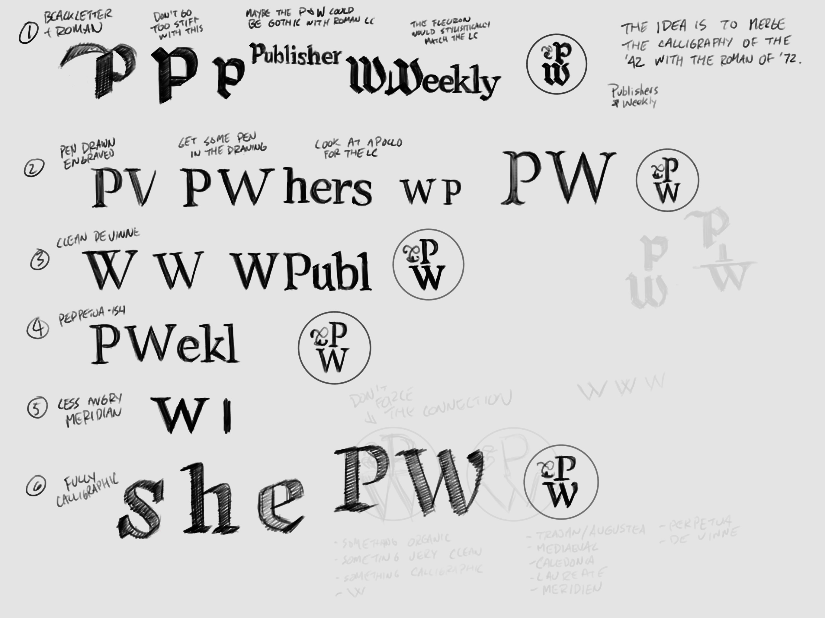
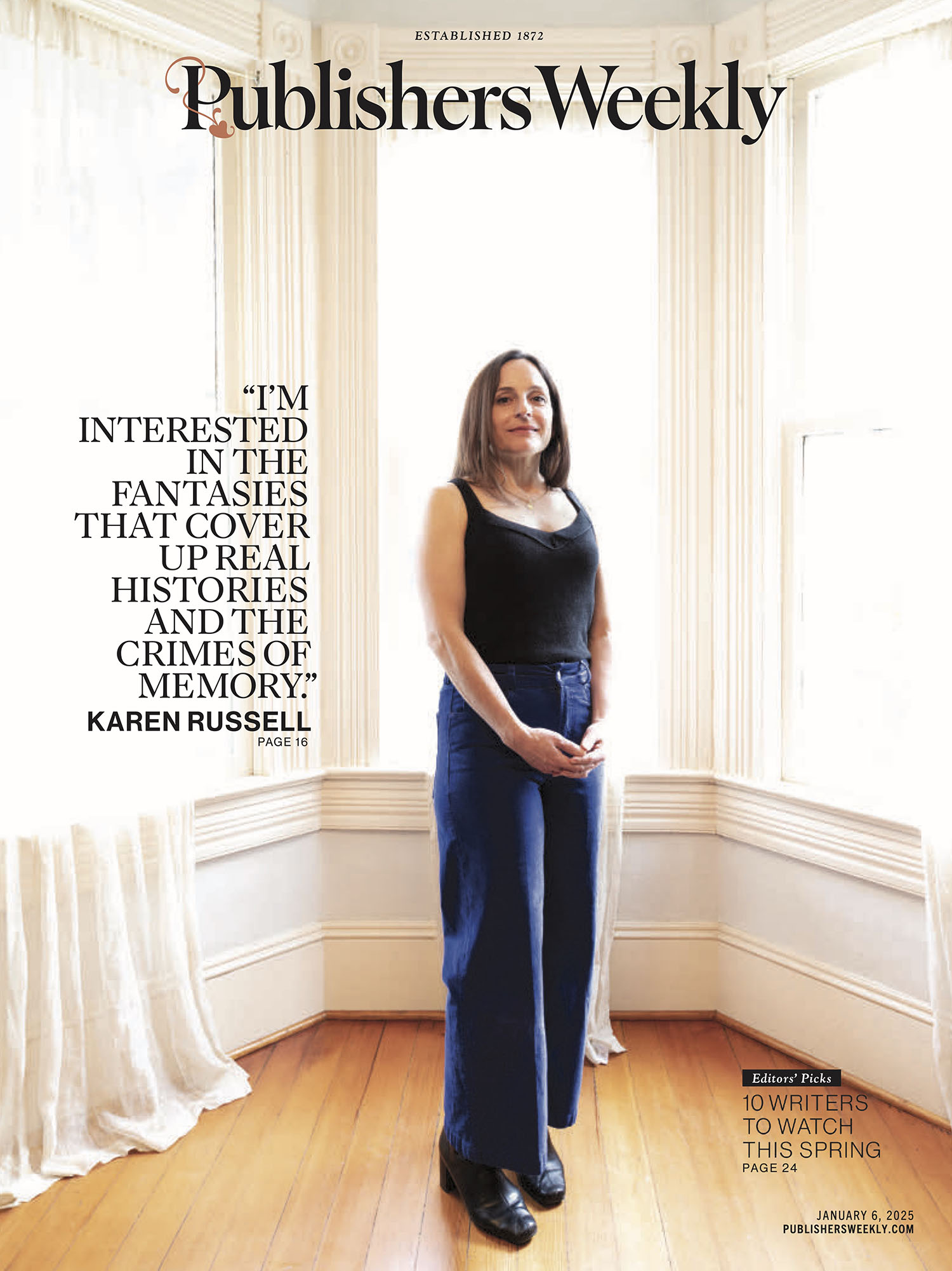
Heather and I were drawn to the pre-digital designs. They had a bookishness that fit Heather’s brief of “bookish, but not old.” We wanted to bring the publication’s visual history forward, but there was so much of it that we had to narrow our scope. I wanted to focus on the publication’s first custom logo, but it was very Frederic Goudy circa 1919: ornamented caps, blackletter lowercase, asymmetrical symmetry. It felt very old. The 1942 logo had more potential, but I ultimately couldn’t find a way to make it feel fresh either. Heather and I were talking constantly throughout my explorations and we hit on the idea of making something that echoed the warmth of the early logos while building on the stateliness of the 1972 logo. That gave me the idea to think about book cover lettering from the 1930s, with its lovely, precise pen lettering. That established how we would render everything.
We had another task in all of this: the fleuron was coming back. I remembered that Frederic Goudy drew lots of fleurons and realized that we could sneak a little reference to him in via our fleuron. I reached out to the Letterform Archive for help and they provided me with a treasure trove of Goudy’s fleurons from throughout his career. I started sketching Goudy inspired fleuron shapes and how the fleuron could incorporate into the logo and monogram. It was at this point that I realized something amazing: the fleuron that George Maas introduced in 1967 was one of Goudy’s fleurons. Exactly one of Goudy’s. Was Maas paying homage or was this just a coincidence? The 1967 essay on fleurons doesn’t mention the connection, but I don’t think that proves anything. In my mind, Maas was thinking along the same lines as me and Heather:
Frederic Friggin’ Goudy drew the first logo. It would be nice to keep his work going, but, alas, it looks too old. What if I sneak a little reference in there. Hm. How about using one of his fleurons?
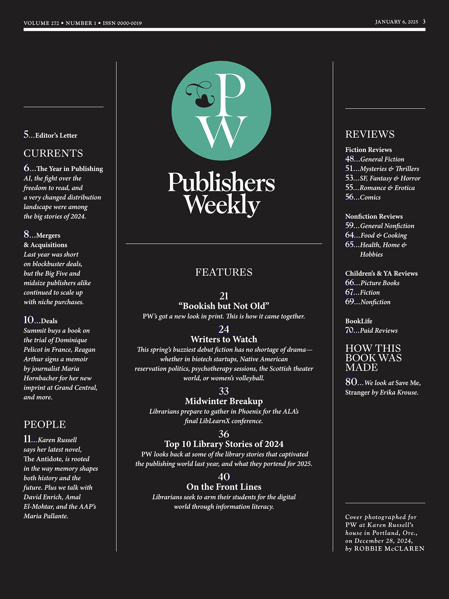
So, we did that. I drew fleurons based on the Goudy fleuron that Maas used. Mine isn’t Goudy’s fleuron per se, but it’s not not his either. It’s a tribute that I hope he and Maas would be happy to notice.
The 1930s inspired rendering style used in all of the marks makes them extremely delicate. That helps establish that “bookish” feel, but each of them needs to work in a huge array of sizes from six point at the end of articles in print to six foot on event signage. A version that was drawn to look big would look terrible small and vice-versa. So, I drew the team optical sizes of each mark that work from six point to sixty feet without ever losing the delicate, smart feel that Heather wanted.
This was a joy to work on. Here are some of the sketches and outtakes we made along the way to the final.