


My friend David Worrell and his team at BRZoom were working on a suite of materials for the Tate’s Bake Shop brand at Mondelez International. The Tate’s style had been established for many years, but BRZoom needed to streamline and solidify production of the art for packaging, advertising, social media, etc. The core problem was that all display text had to be rasterized and pushed through a series of Photoshop filters to create an approximation of chalk lettering. This was a cumbersome process and text couldn’t be edited after the effect had been applied. This meant that any copy changes were a huge setback to production timelines. On top of this, the resulting text didn’t look much like chalk lettering. I worked for David as a graphic designer early in my career and one of the things that I was oddly competent at was figuring out ways to do tricky stuff in Photoshop efficiently. I was especially good at making things that didn’t exist look real. (One time I made a PT Cruiser look like a banana and David had to convince the client that we didn’t actually have a PT Cruiser that looked like a banana.) David figured that maybe I could dust off that part of my brain and combine it with my typeface design knowledge to find a solution for the Tate’s text problem. One of the catches in all of this was that Tate’s didn’t need a massive change in their branding. So, I needed to stick to the same style that they already had in place.
I gave it some thought, did some experimenting and showed David a proof of concept.
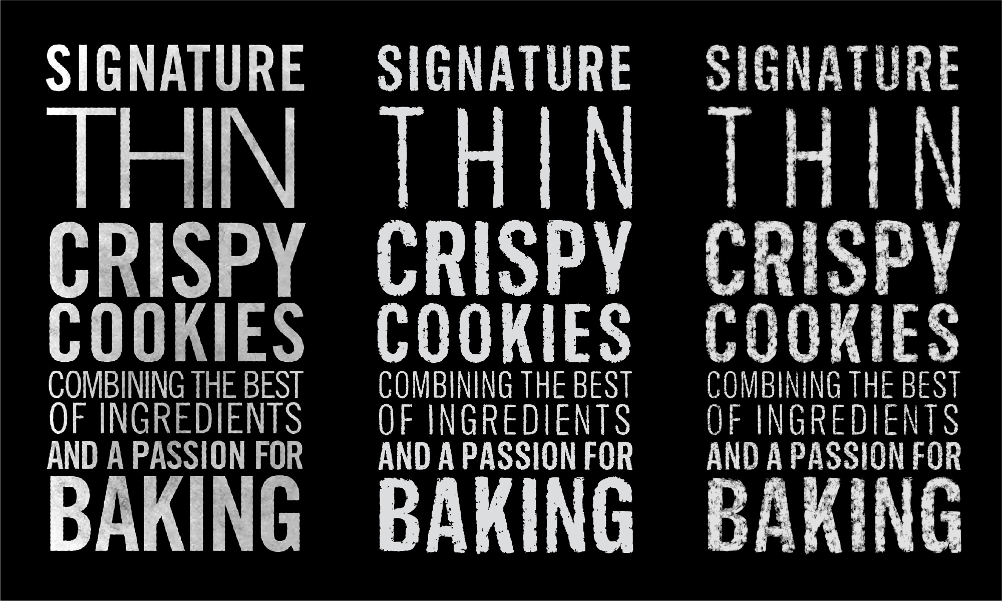
The left is what the existing Tate’s text looked like. The other two are chalk renderings of my typeface Balto (it was the closest thing I had to the Tate’s typeface.) The one in the middle is a single color vectorization of my drawings. The one on right is a vectorization using three different shades of one color. The idea on this was that there would be three fonts that would be layered in different opacities to create an ultra-realistic texture. David liked these and gave me a budget for the project.
The first thing that I needed to do was draw a clean base typeface that I could use as a template for my chalk drawings. The base art of the Tate’s chalk textured text was an off-the-shelf, early digital version of a sans serif from the metal type era. I don’t make revisions to other designers’ fonts for a variety of reasons, so I set out to draw a new typeface in a similar style. I took this opportunity to make something that was more suited to the Tate’s brand. I was provided with a brand foundation to think about during the project.
Warm, supportive, comforting, optimistic, caring, encouraging and inclusive. Casual not formal. Authentic not nostalgic. Encouraging not preachy. Happy not silly. Uncomplicated but extra-ordinary. Gentle but not feminine.
When I am making a typeface that needs to evoke hand lettering, I ask myself: Who made these letters? Why? Hand lettering often implies that the letterer is a person directly associated with the brand. I used the brand foundation to establish a profile:
Someone from the Bake Shop drew the letters. They are not a professional letterer, but they are quietly confident. They used materials at hand: chalk and a chalkboard. They weren’t trying to be artsy, nostalgic or childish. They were simply conveying their joy for the Bake Shop’s delicious cookies.
This profile told me that I needed to make something warm and deliberate that didn’t look like a typeface. This made me question the text on the Tate’s materials that wasn’t rendered with the texture. It used the same off-the-shelf typeface and could be improved. I emailed David and Lindsay Bornkessel, the BRZoom Art Director for the project and said, “I’ve been thinking. Your budget is good and I’m already drawing a new base typeface. Would you want to replace all of the text with a typeface proprietary to Tate’s?” They said yes.
Drawing the base was pretty straightforward. I drew a classic 1950s American sans serif style from memory and put a lot of warm, humanistic elements into the drawings. The strokes have modulation rather than mechanical precision. Key shapes are slightly top heavy. The lowercase has a generous x-height. Dots are round instead of square. Lots of little details.

I did all of this in two widths with four weights each. We tested it as a replacement in all of the Tate’s materials and it worked great. It did especially well on packaging, even the tiny legal text and ingredient lists. The folks at Mondelez were thrilled and approved the base typeface.
I set to working out the chalk rendering style and gave Lindsay a whole bunch of methods to choose from.
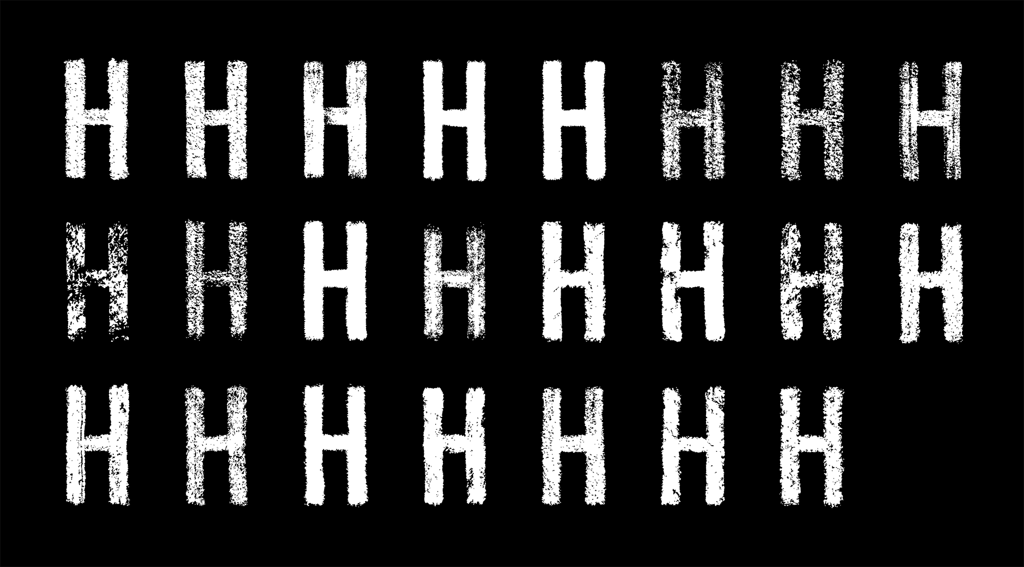
She decided that we should go with a single layer for simplicity and picked a rendering method. I started the first weight and quickly realized that I had a problem. Drawing and digitizing all of this was going to take an enormous amount of time. I timed myself going through the process and calculated that it was going to take me several hundred hours of tedious, error prone work to get everything done. Then, if Mondelez didn’t like the texture, I would have to do it all again. This wasn’t tenable, so I had to come up with a different plan. Also, I had Covid and decided to isolate myself in my office for fourteen days. While I was in there I did what anyone with a 103° fever would do: I made a robot. Well, not a physical robot. I made a piece of software that would take the base typeface, render it with digital chalk and produce fonts. The robot had all sorts of options:

The robot took some time to create a full typeface (about an hour per style), but Lindsay and I could dial everything in to just the right amount of texture. This automation also allowed me to produce numerous alternates of each character to hide the repetition of identical shapes.

All of this was inserted into text automatically with some OpenType feature code allowing anyone at Mondelez to quickly create high-quality art for any need. This project ended up delivering much more than Mondelez asked for. It also used much more technology than I thought a chalk font could ever need.