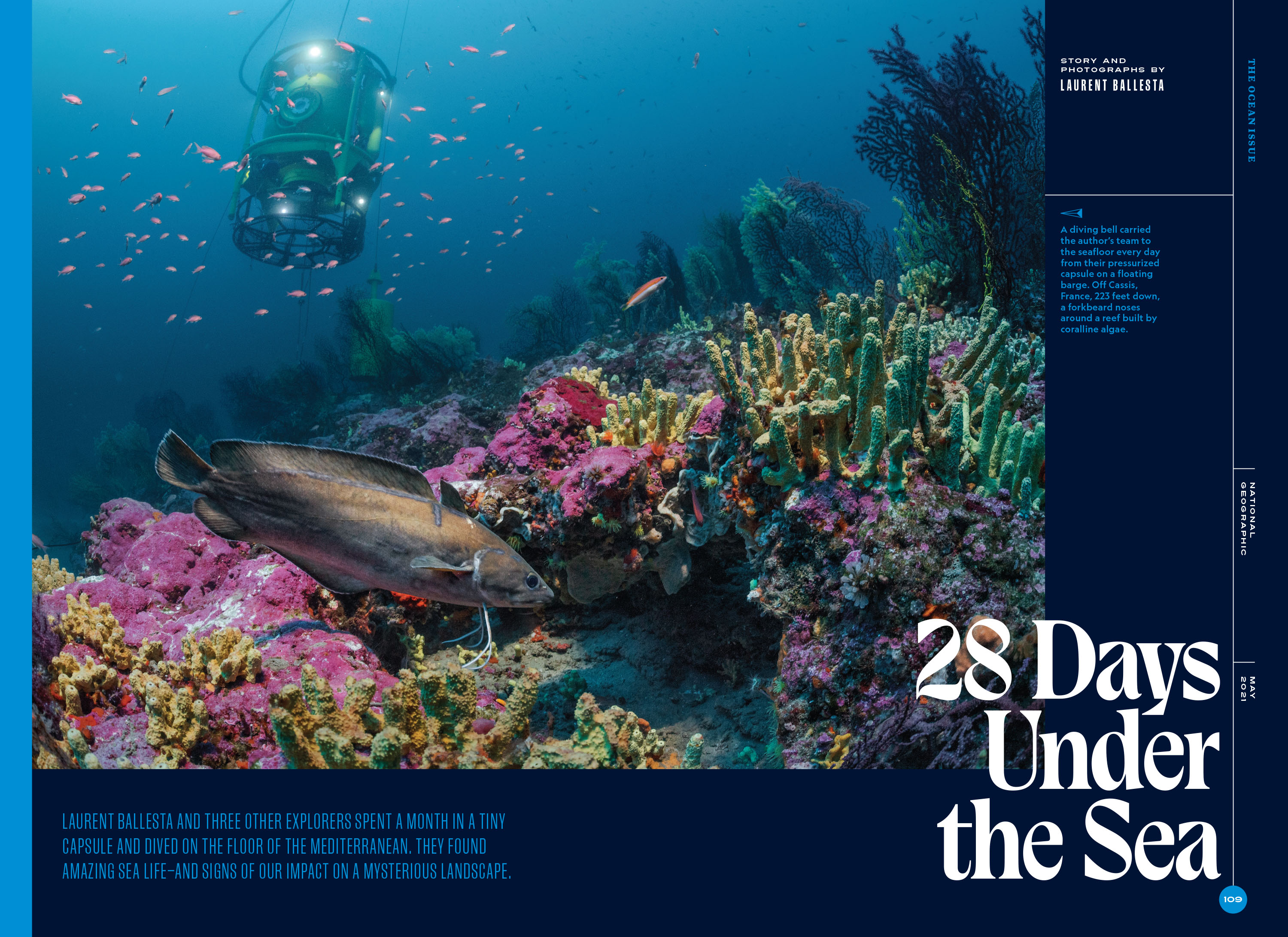
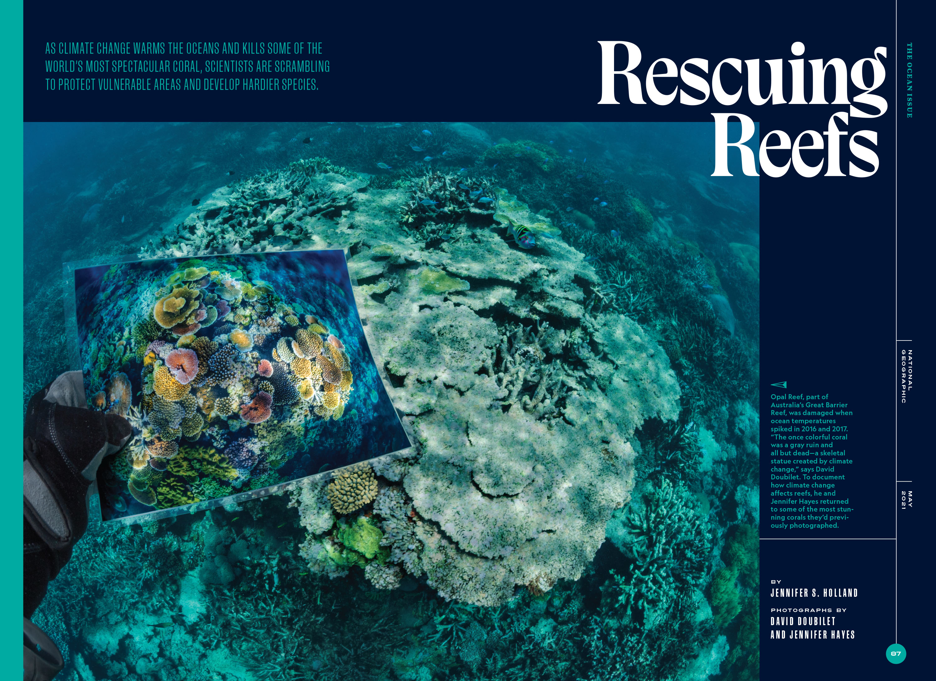
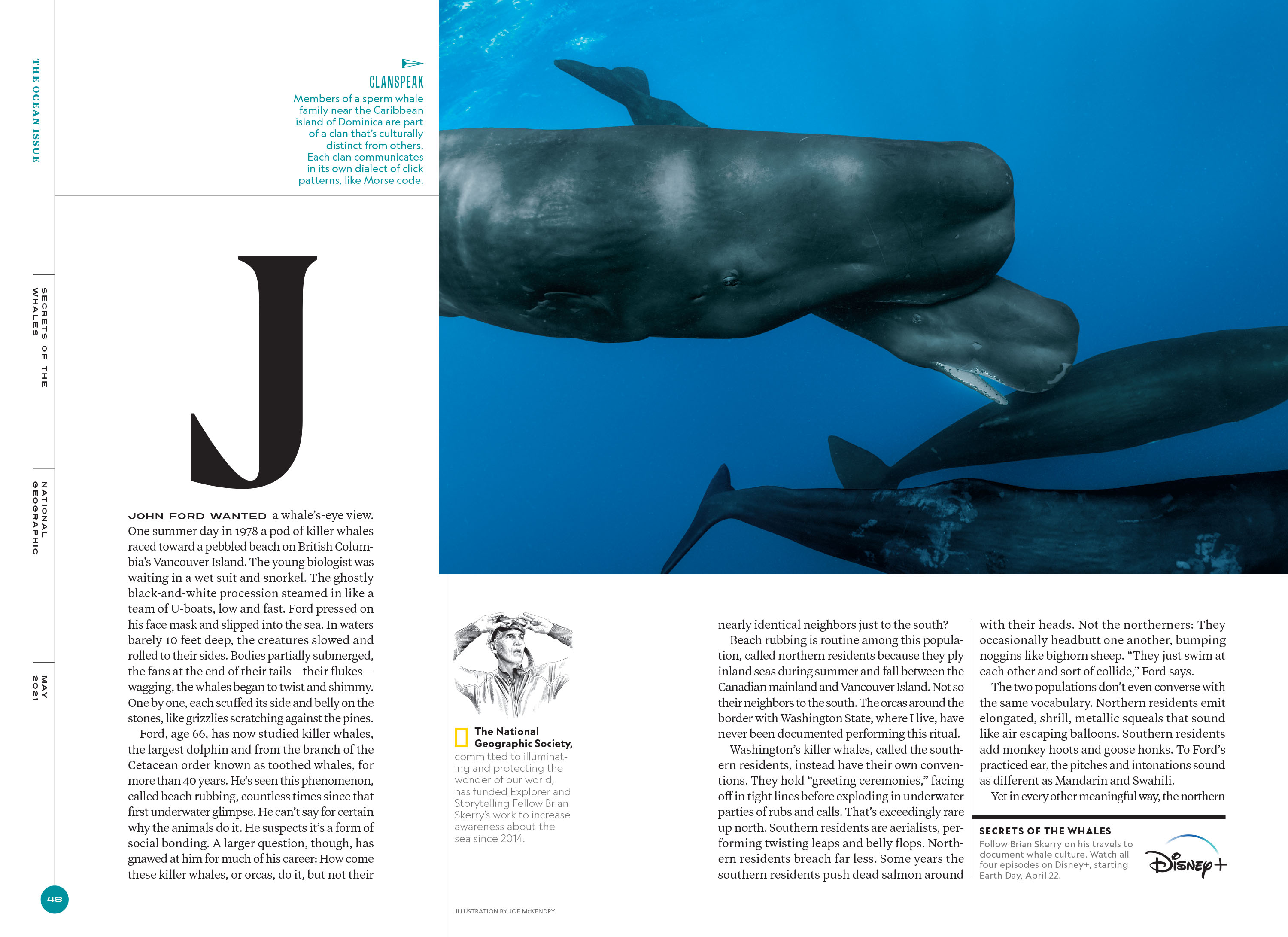
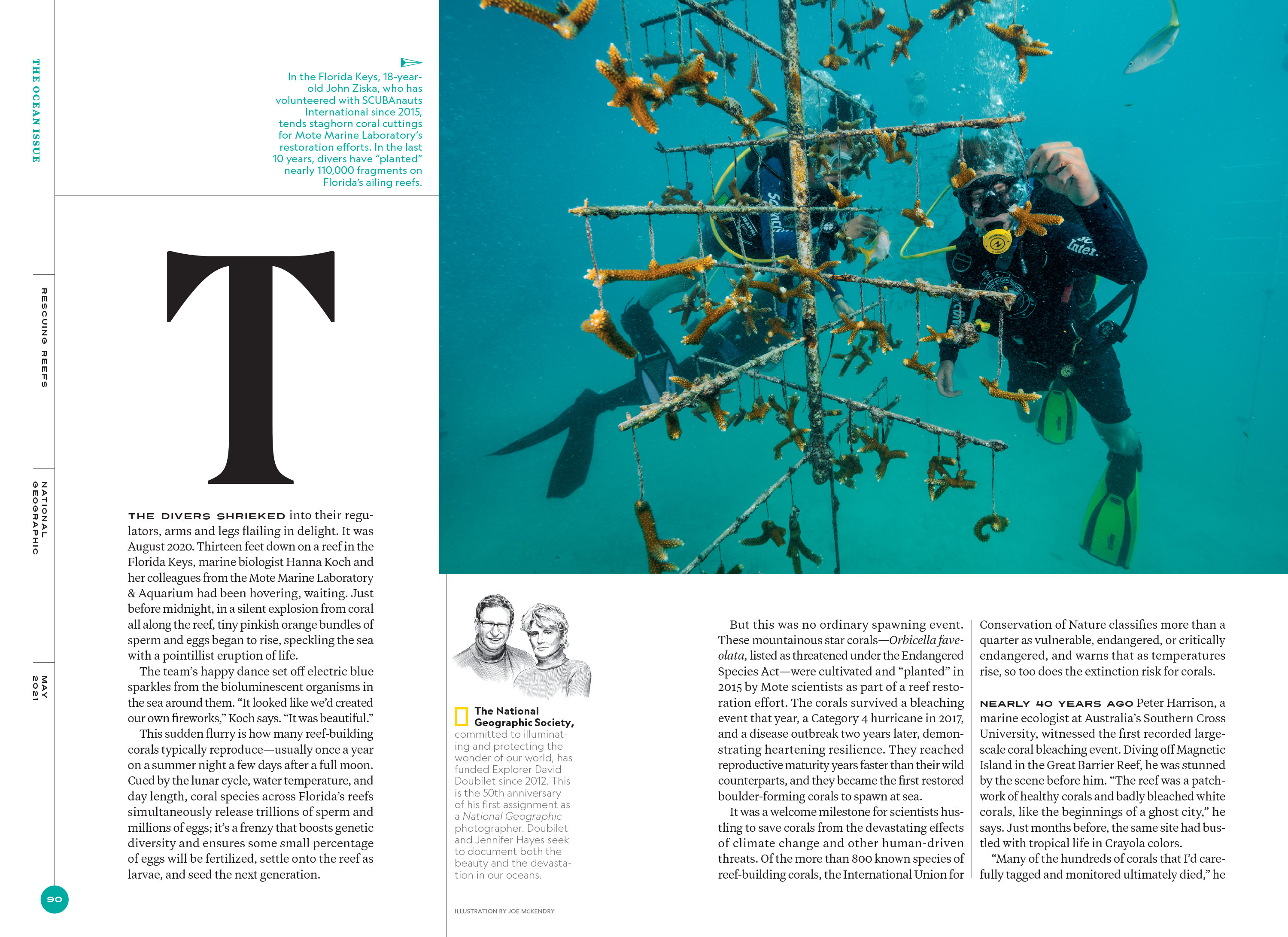
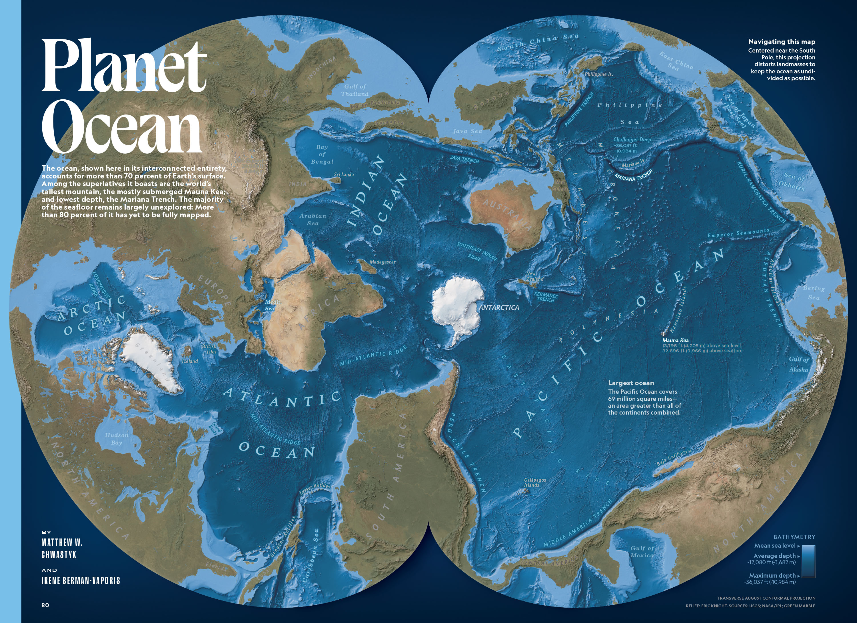
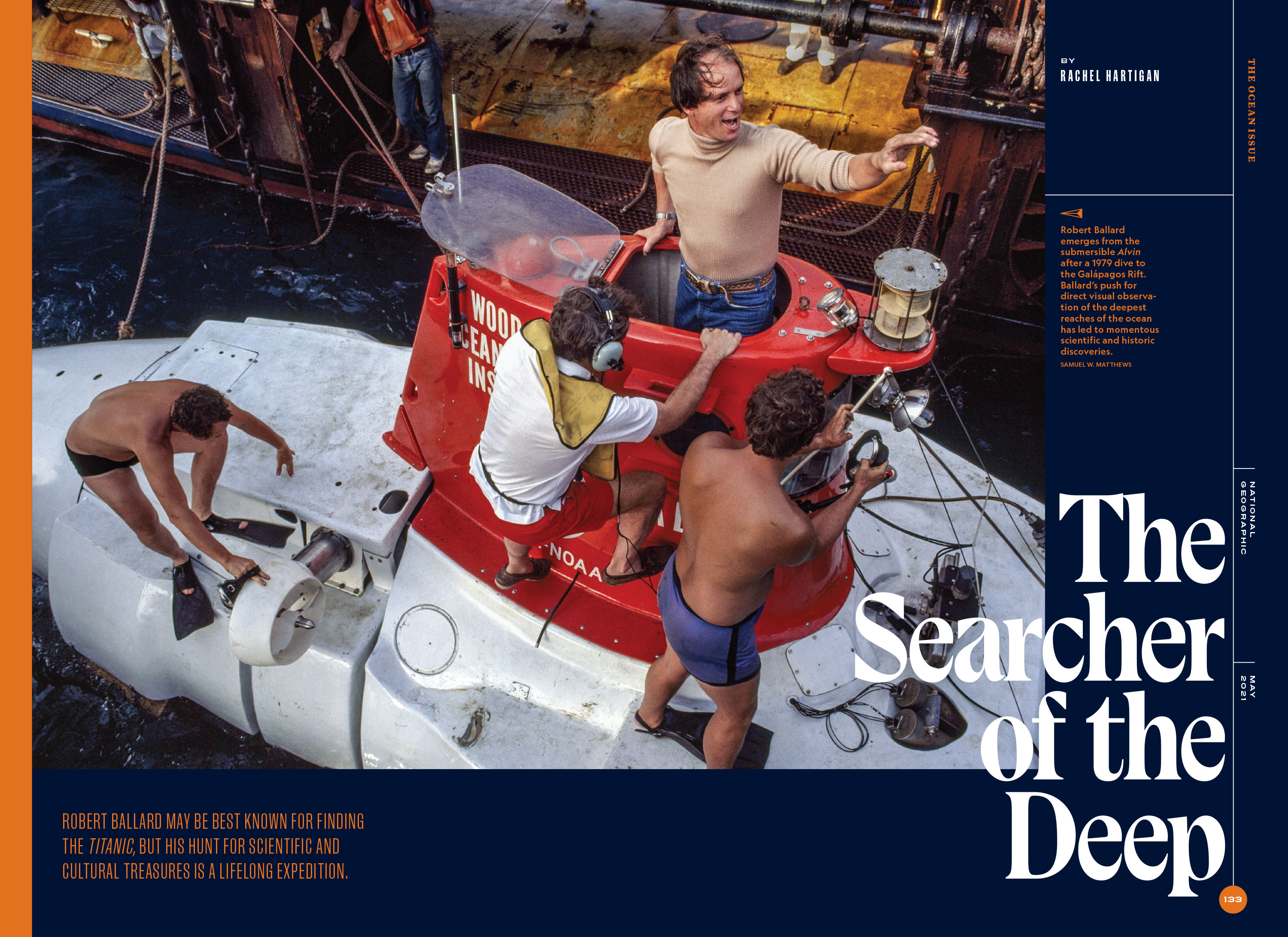
Hannah Tak was working on a special issue of National Geographic about Earth’s oceans. She wanted a typeface that evoked the flow of the oceans and was reminiscent of ornate lettering on antique maps. We tried a lot of different styles before we found the final one. It was a real challenge building something free flowing on the mechanical structure that we had established with Earle. To accomplish this, I thought of the letterforms almost as a fluid or cloth flowing over the basic armature without regard for traditional stroke contrast and letterform structure. The result has an ebb and flow that feels very natural, but still resonates with the overall typographic palette we were building for National Geographic.


