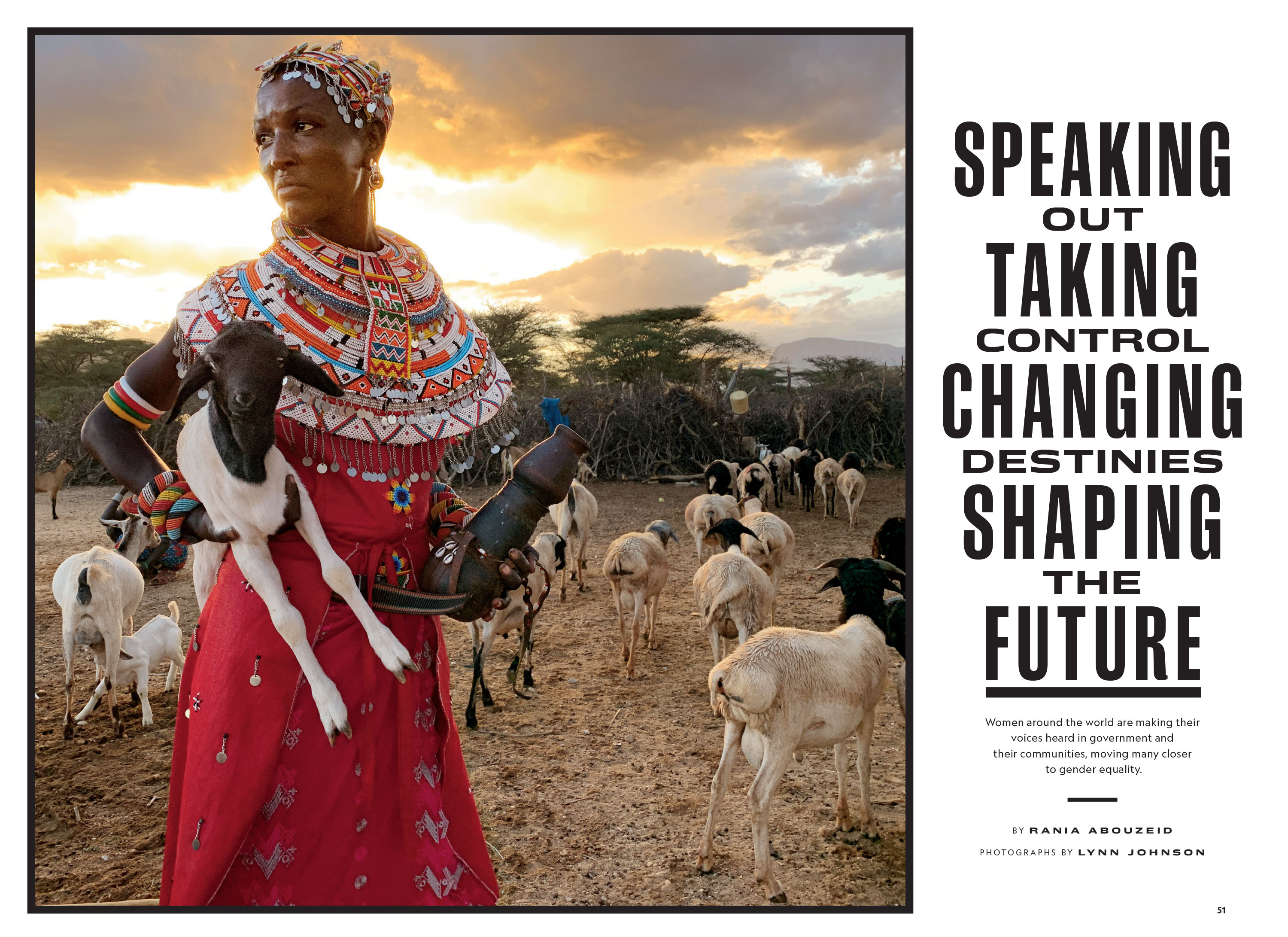
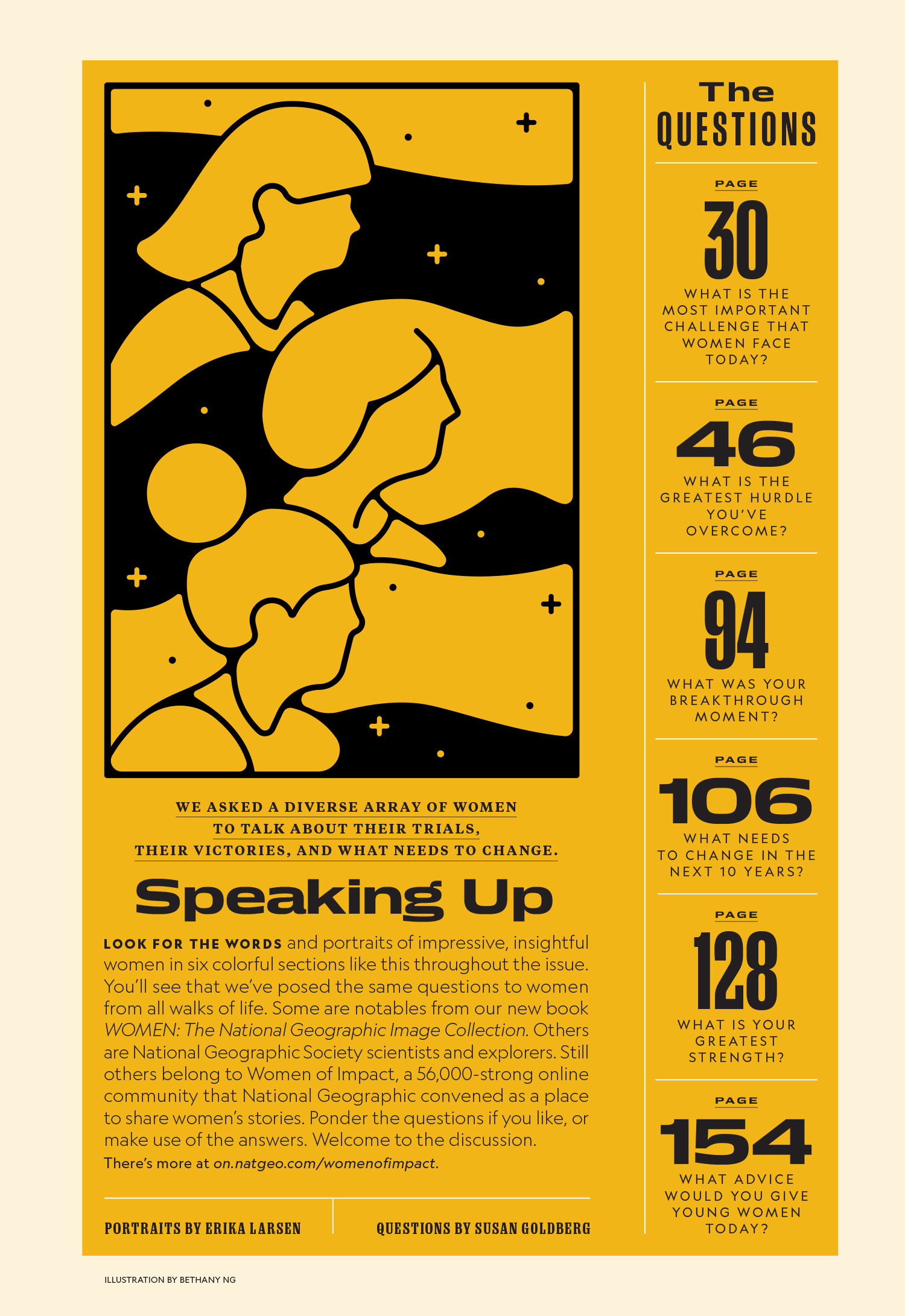
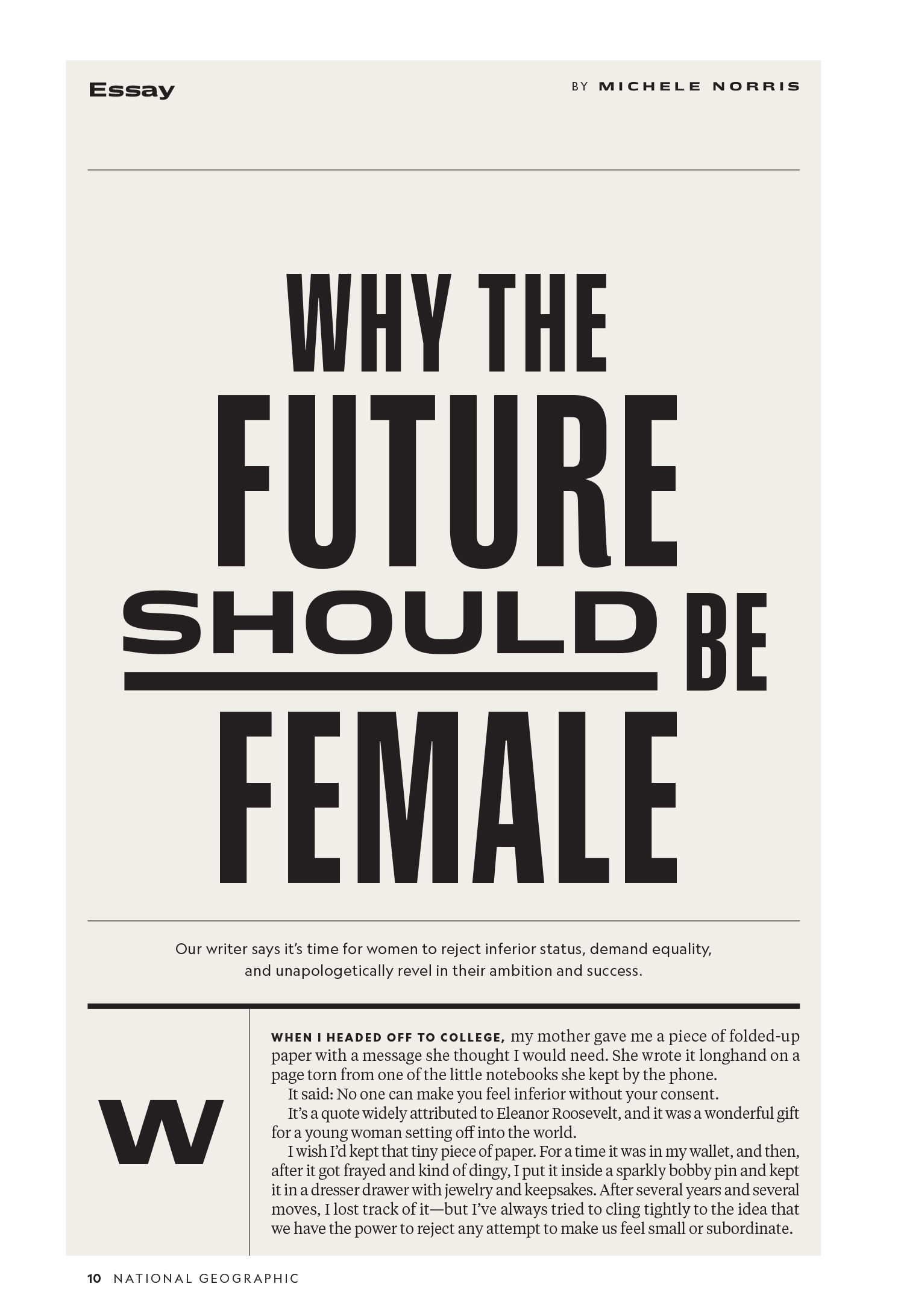
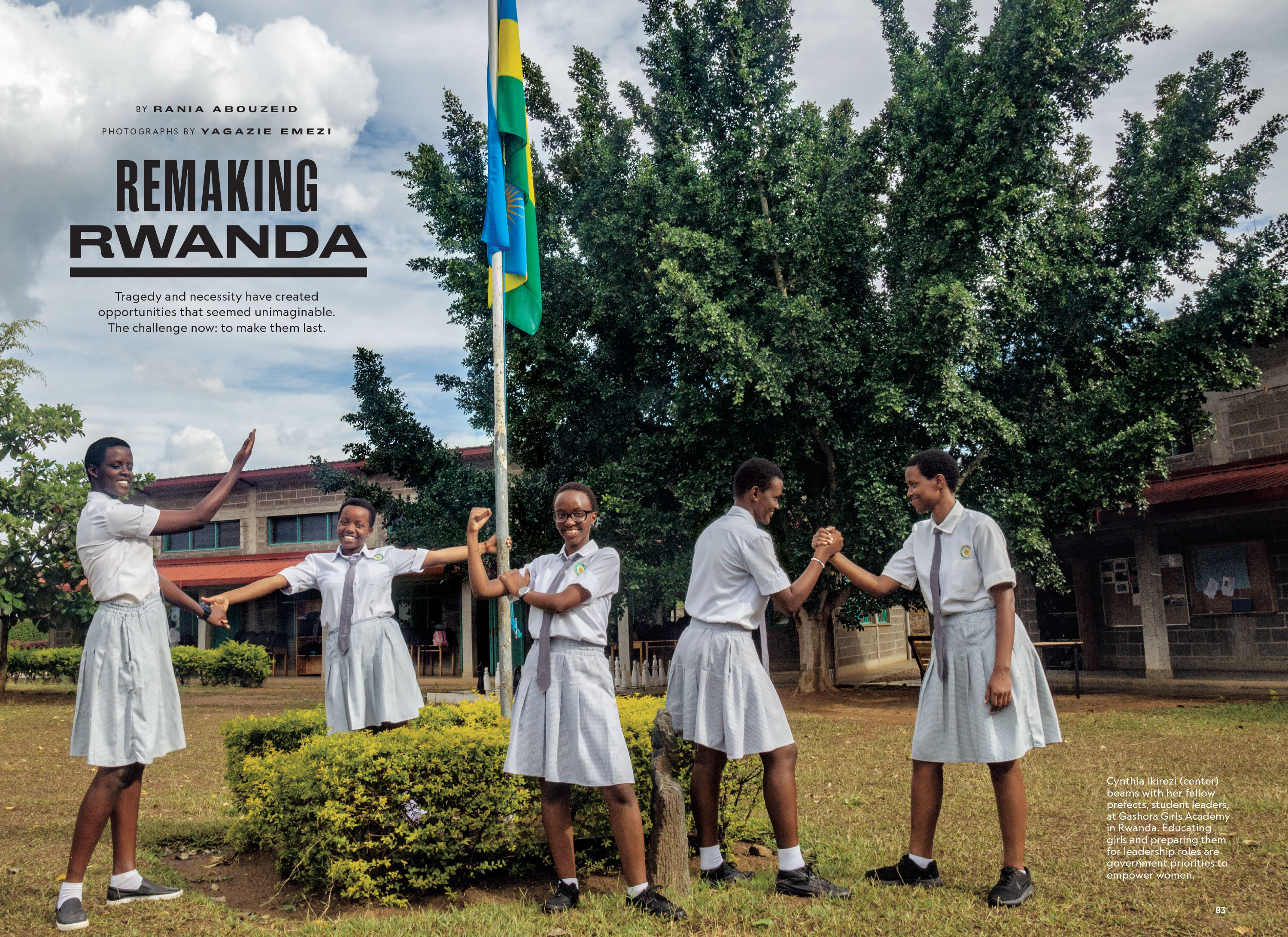
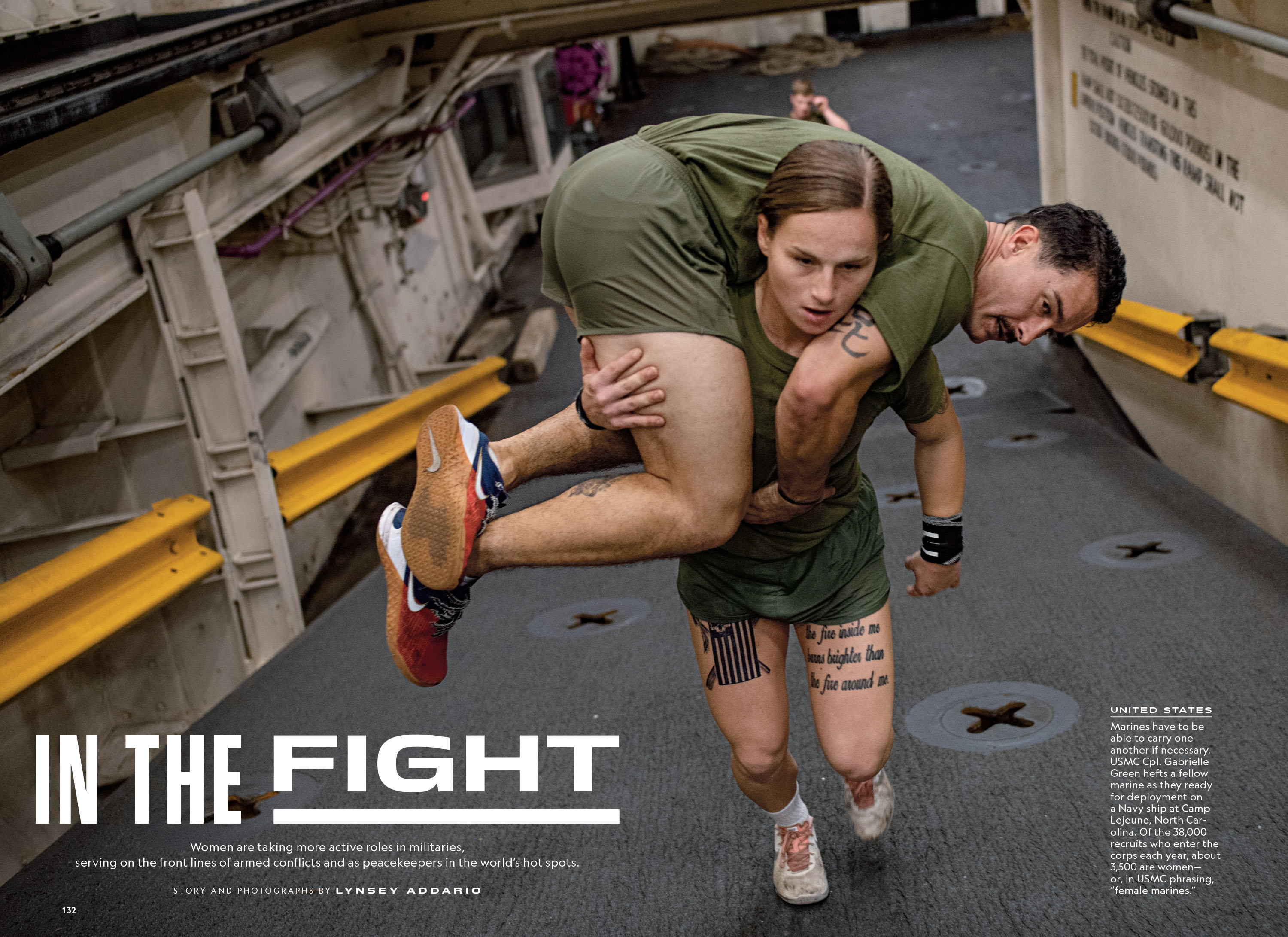
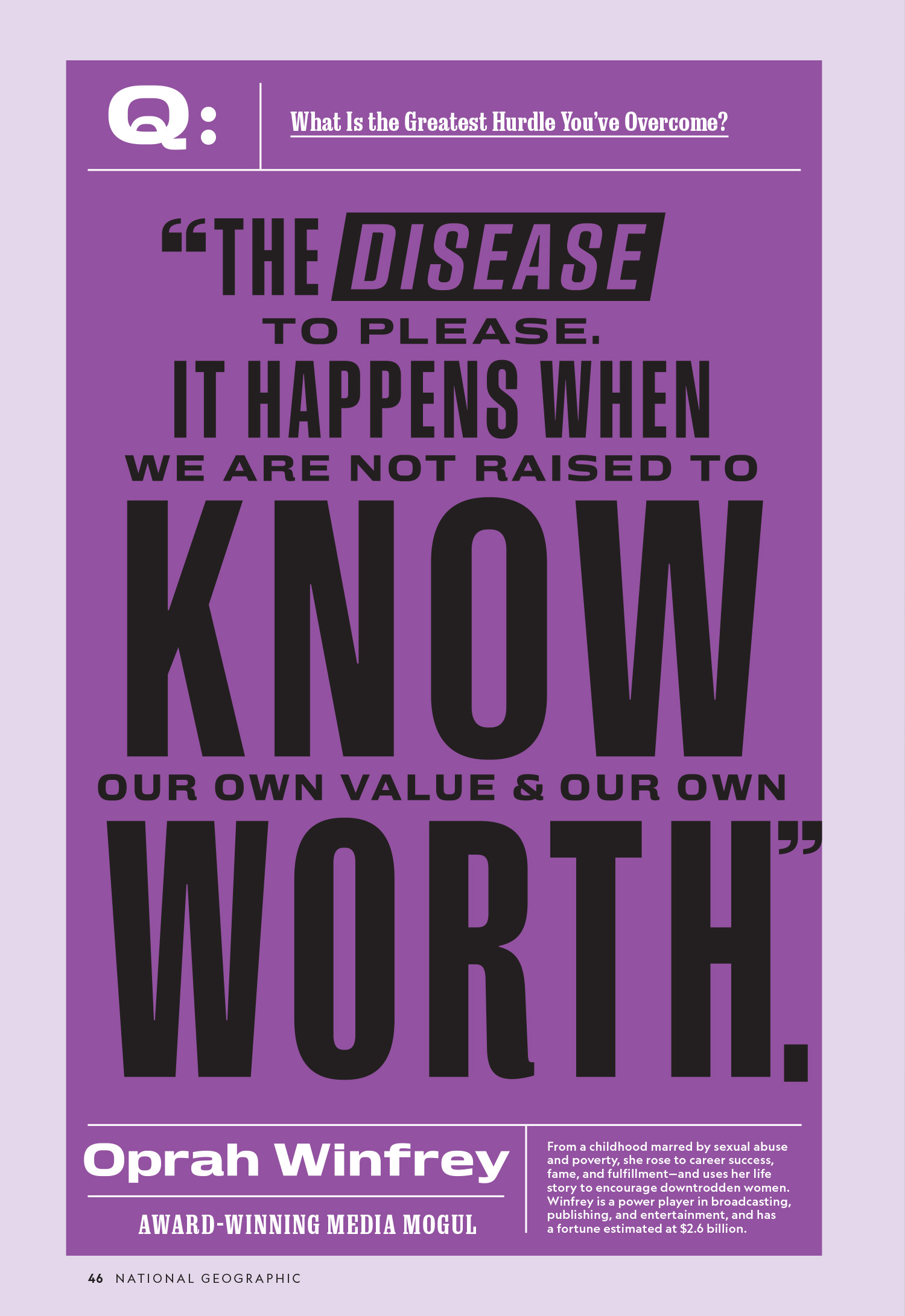
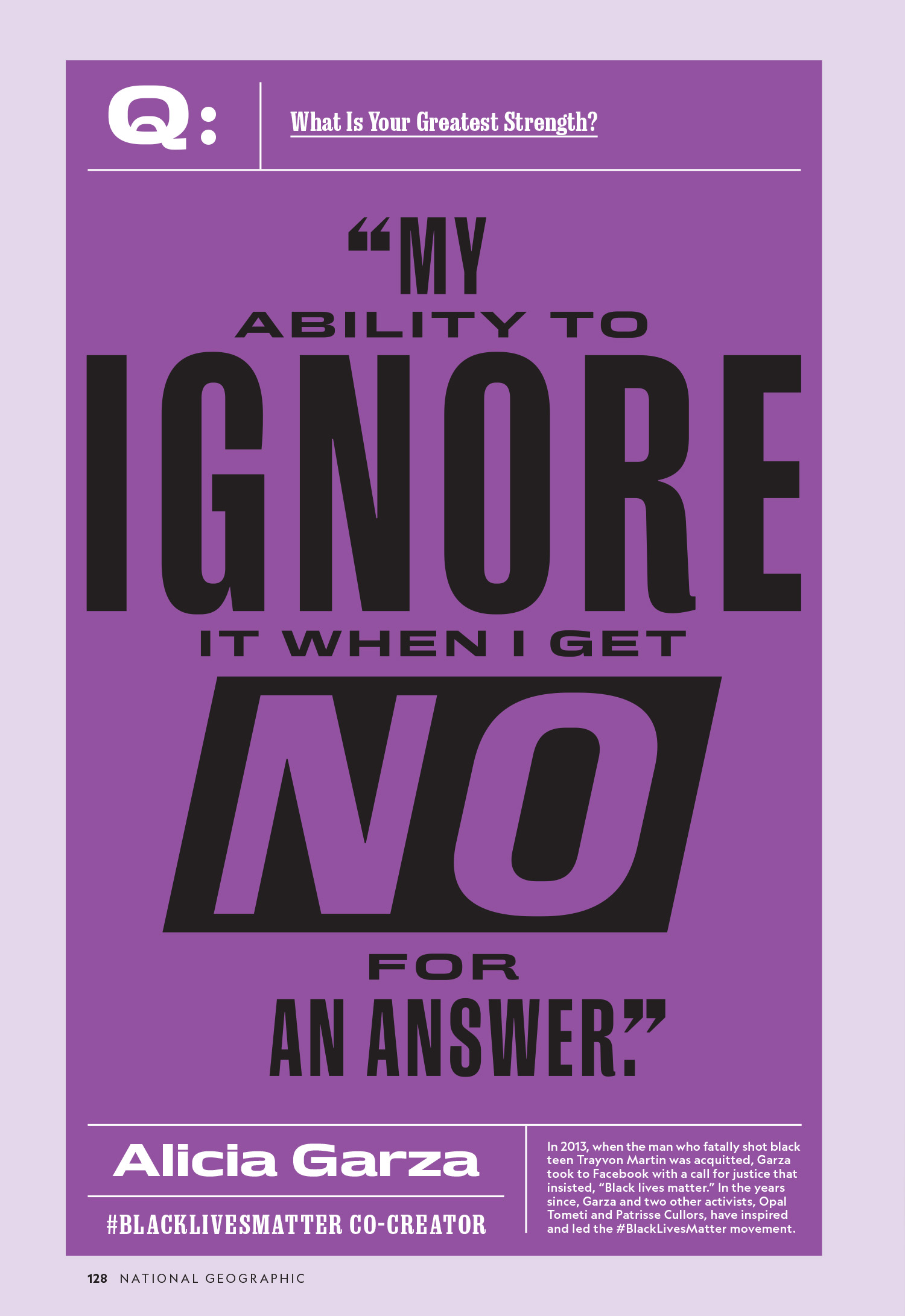
Marianne Seregi tasked me with drawing a wide version of Marden. I’ll never forget her hilarious description of what she wanted: she wanted it to be the typographic equivalent of manspreading. This was a tricky assignment because the closed terminals and flat vertical curves in Marden limit how wide the letters can go before they become either illegible, ugly or both. I presented Marianne with seven different approaches, we discussed, I redrew and we repeated these steps until we had something that worked hand in hand with Marden. I used a variety of techniques to accomplish this: I discarded Marden’s closed terminals in favor of unapologetically open terminals; I traded flat vertical curves for flat horizontal curves; I maintained the Marden DNA by carefully repeating the same underlying armature for the core shapes of the letters. Marianne named the typeface Daggett after Hallie M. Daggett, the first woman employed by the Forest Service as a fire lookout. This project laid the foundation for many future collaborations between the myself and the amazing team at National Geographic.


