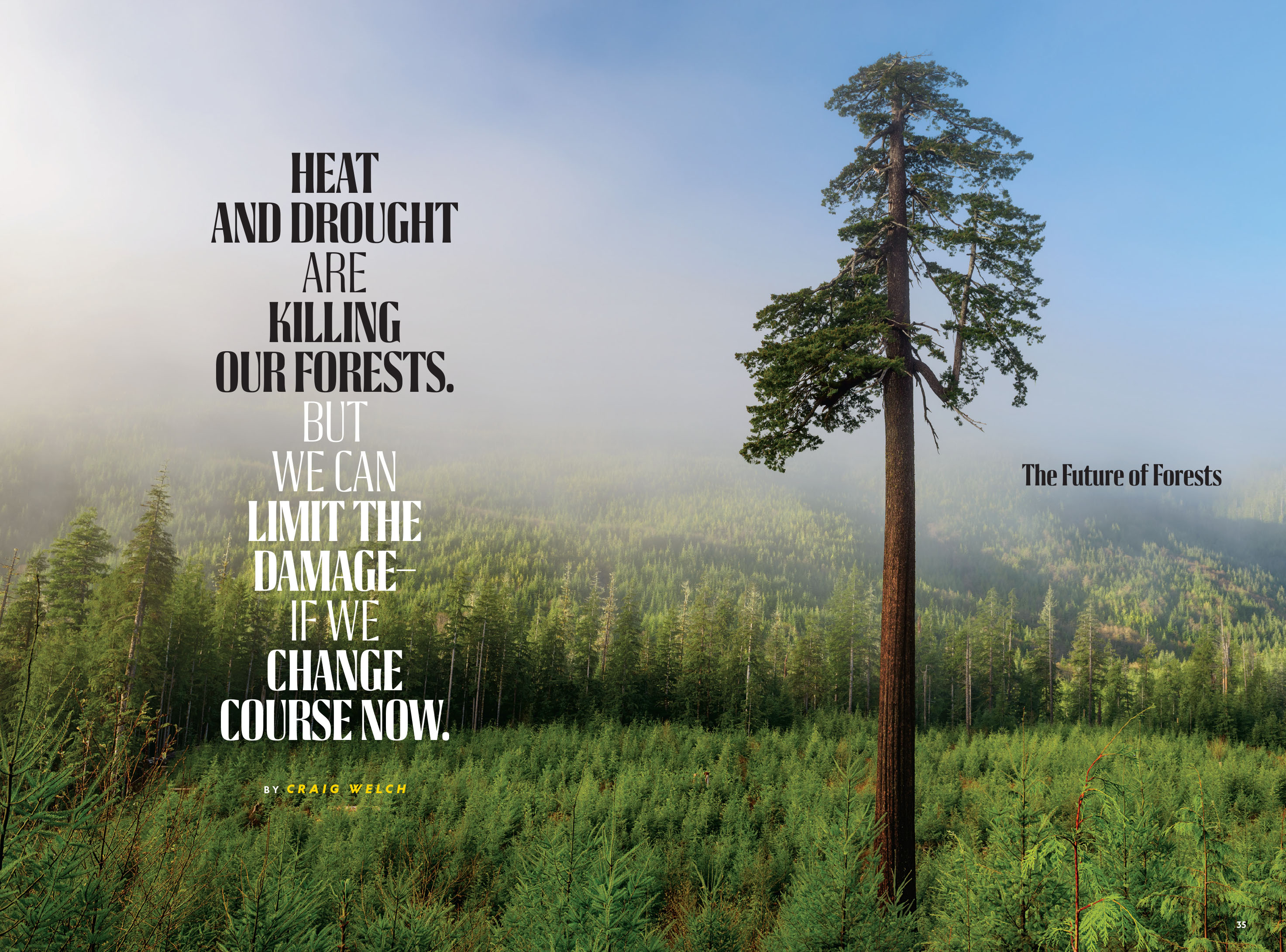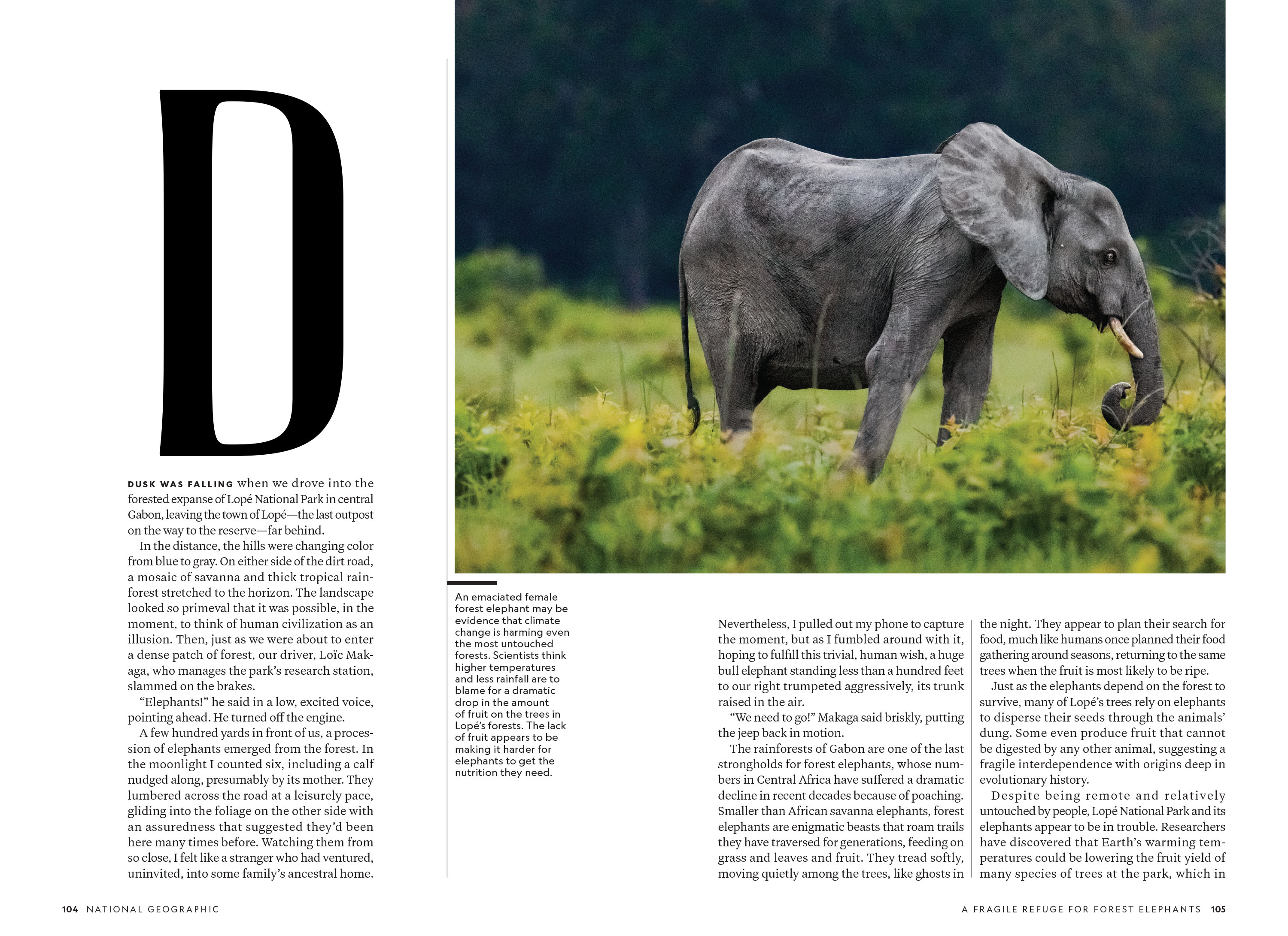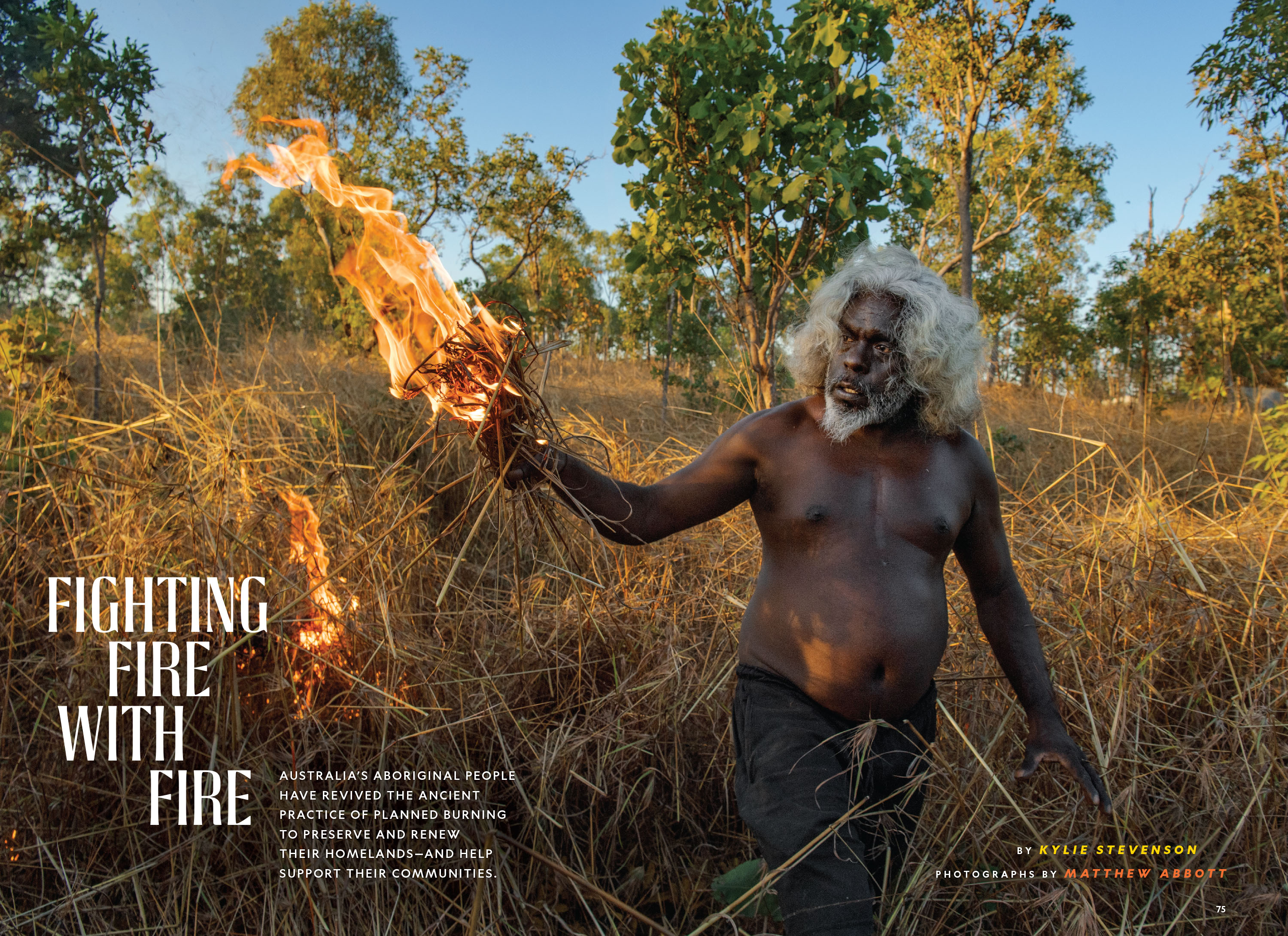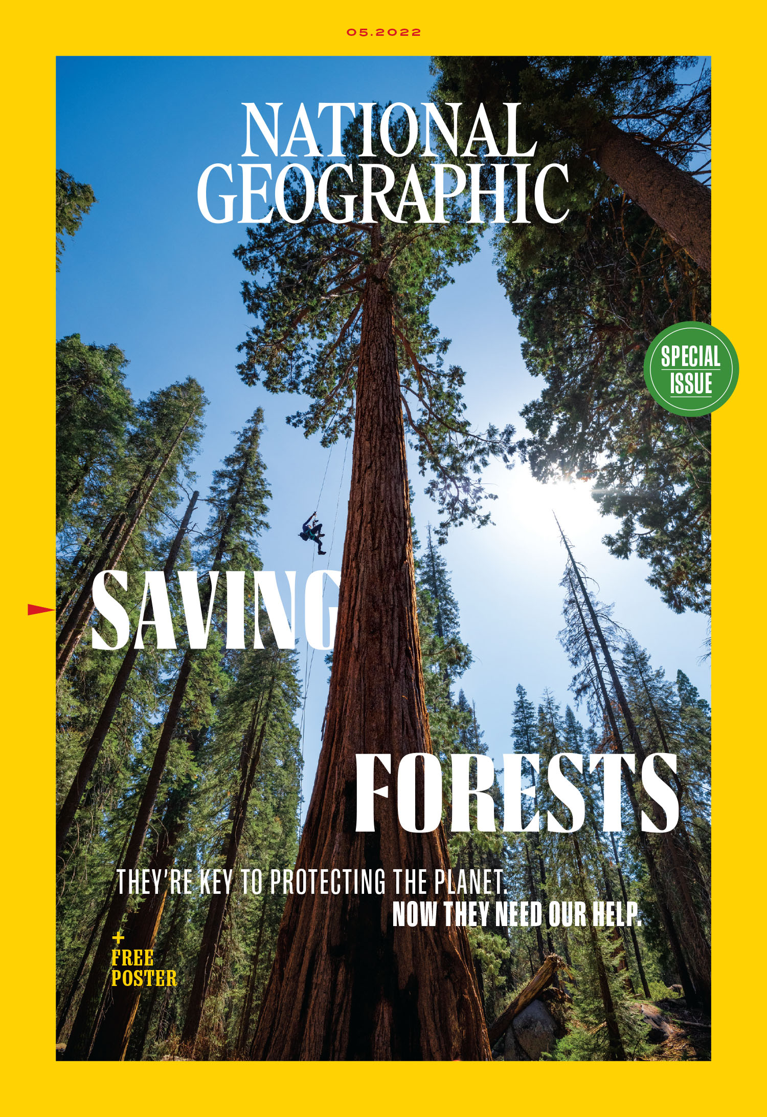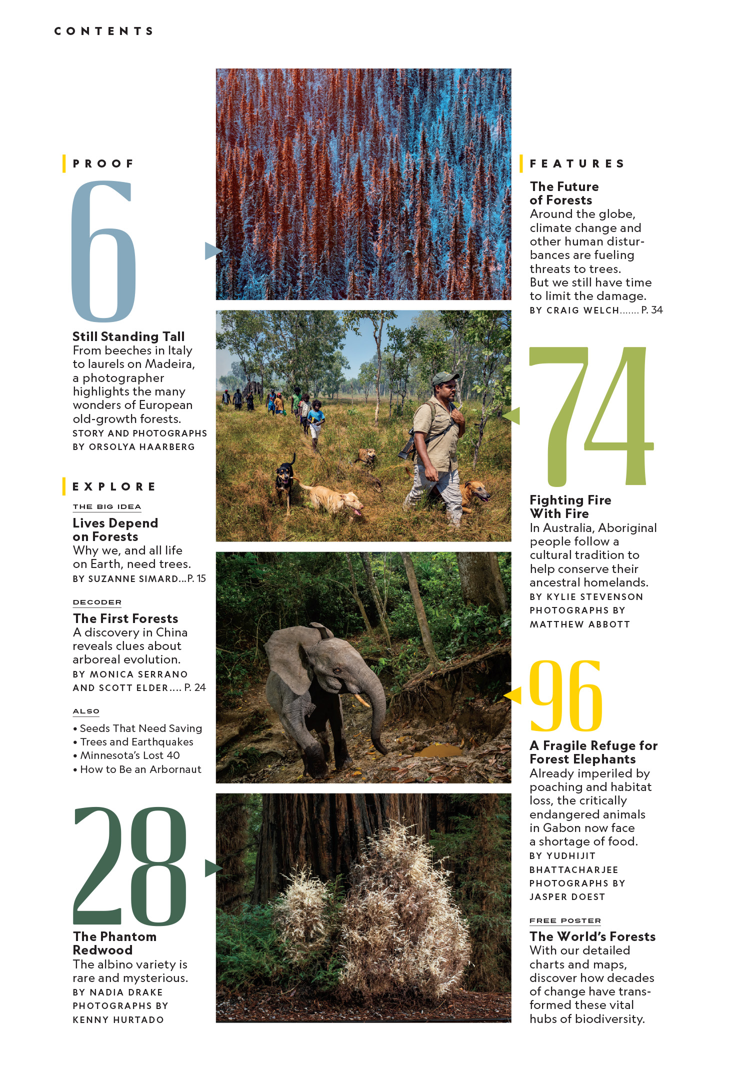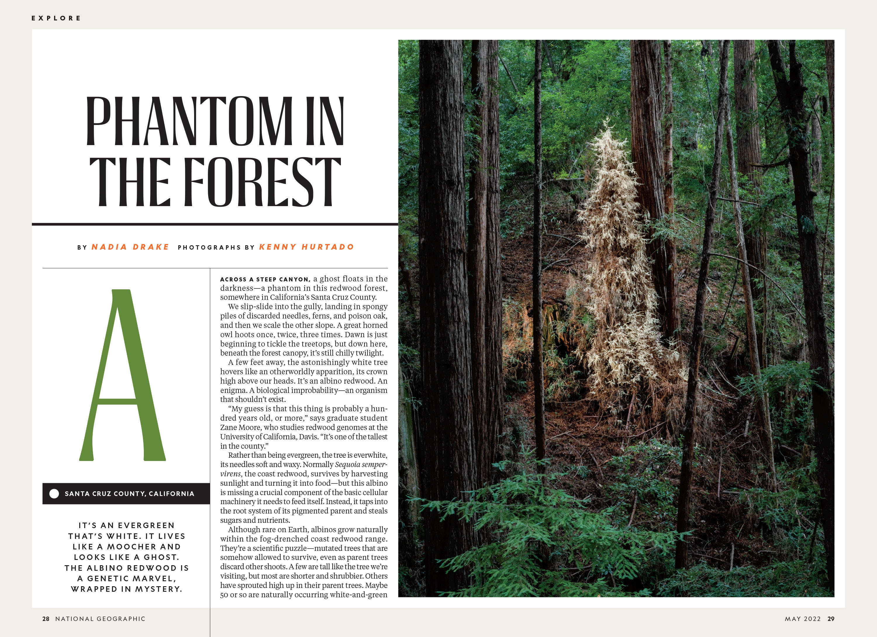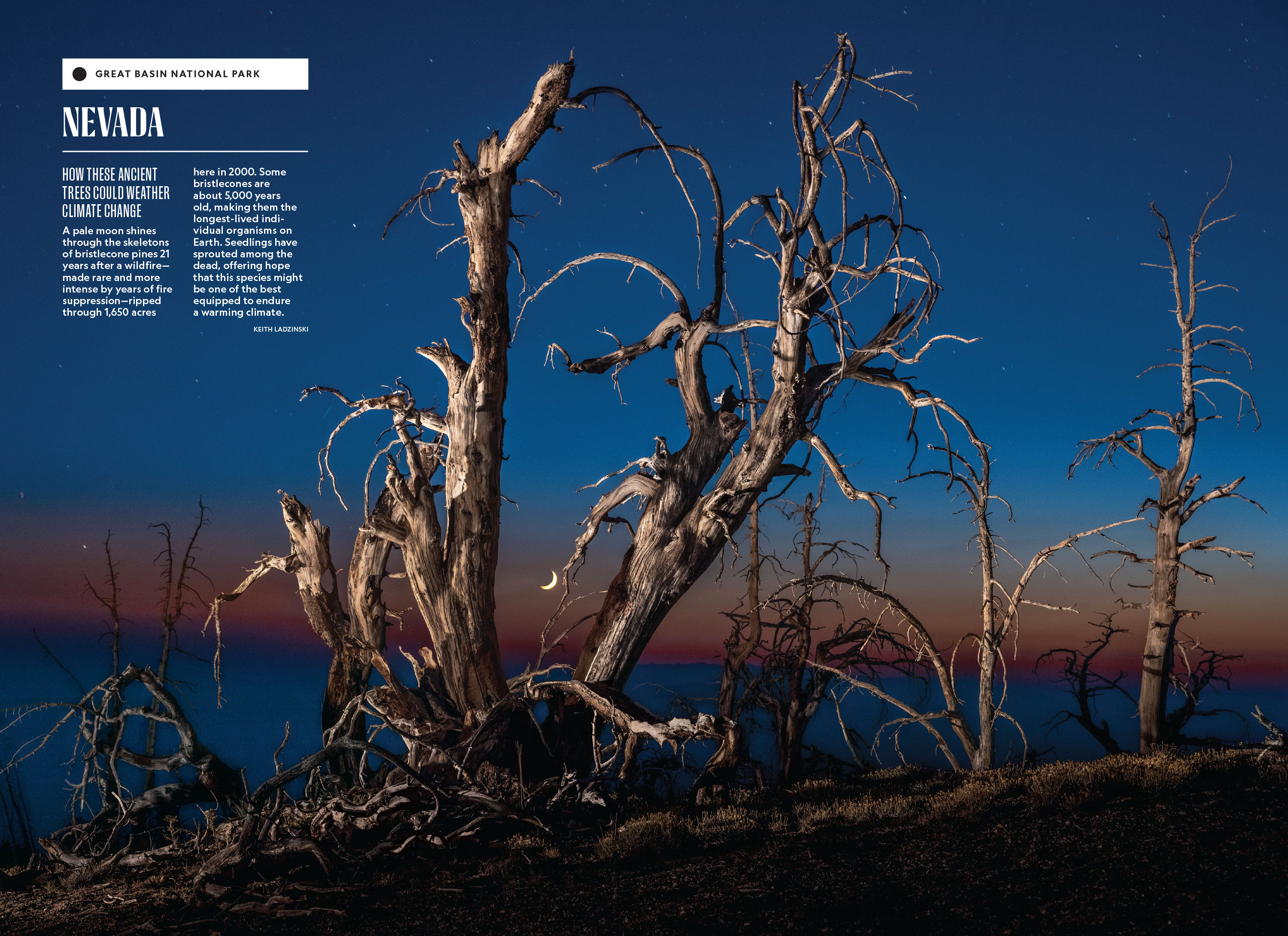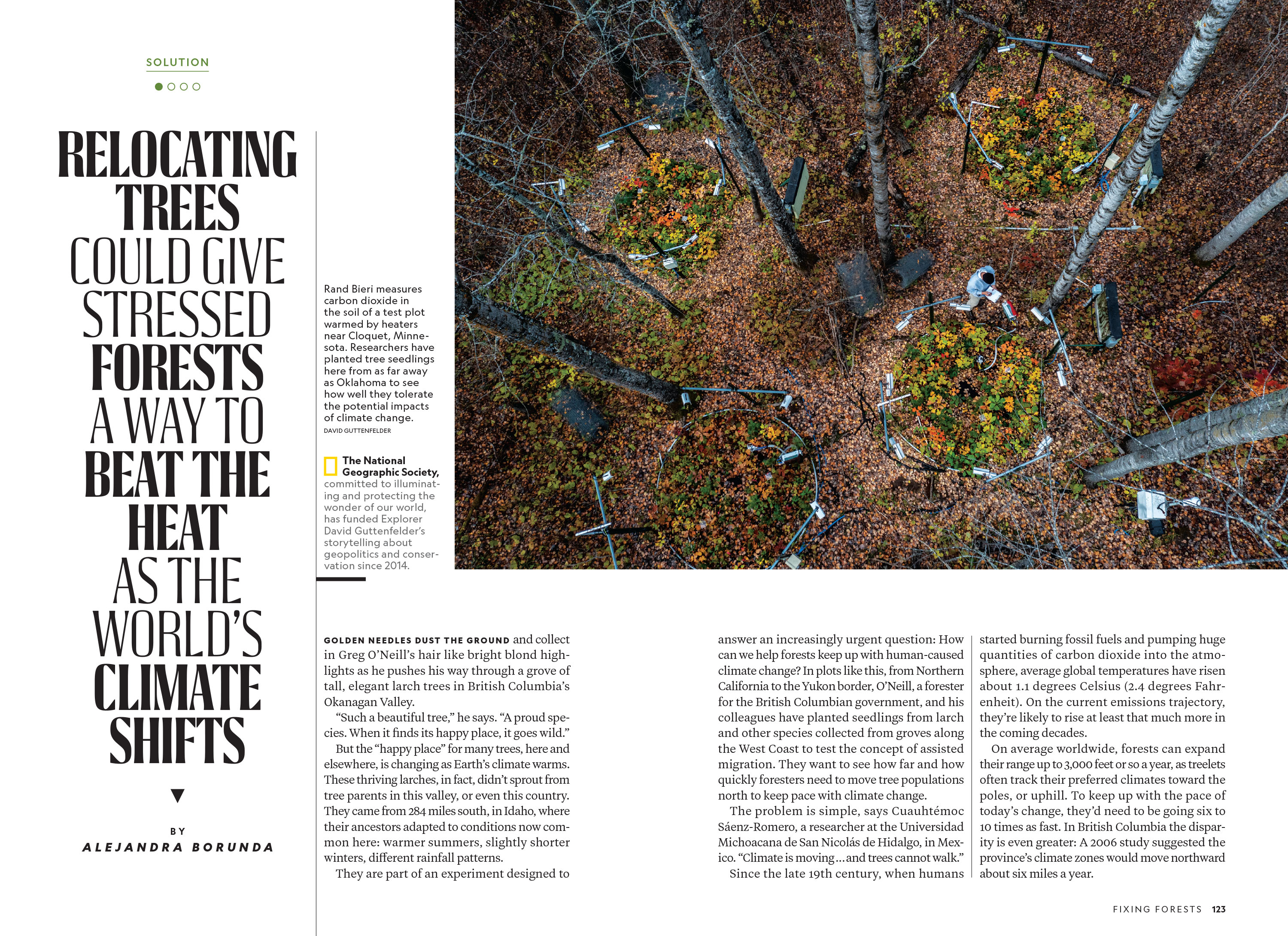

Hilary VanWright at National Geographic was leading the design of an issue dedicated to the state of the world’s forests. She wanted a typeface that would feel organic, worn down and neglected (like Earth’s forests) but didn’t undermine the precision, solidity and authority of the overall Earle family. We tried a lot of different styles before we ended up with a multi-weight family featuring broad curves and subtle detailing. Hilary used it throughout the magazine in a variety of sizes and contexts. This typeface joined the magazine’s typographic palette and was deployed when an organic tone was needed.
Art Director: Hilary VanWright
