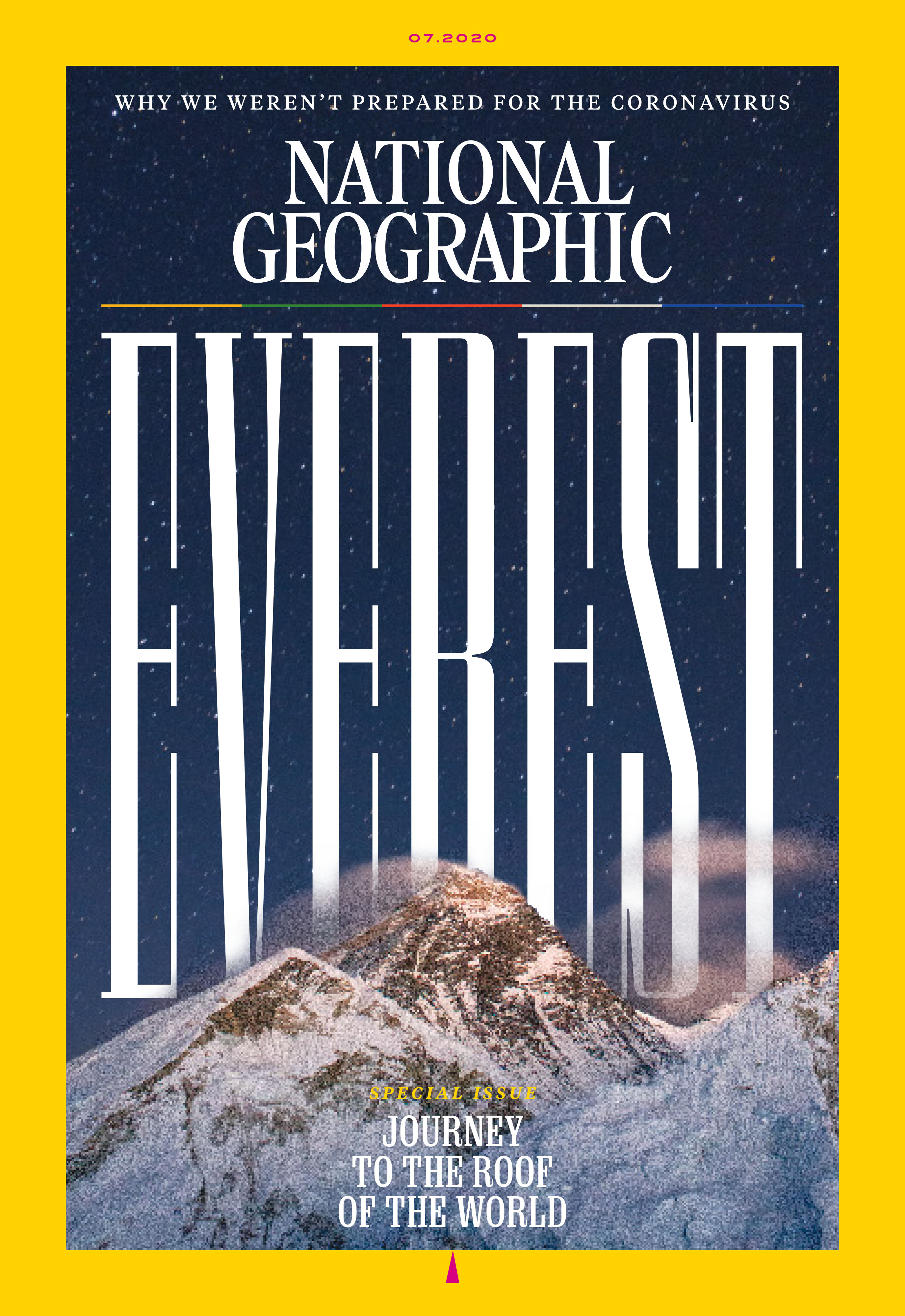
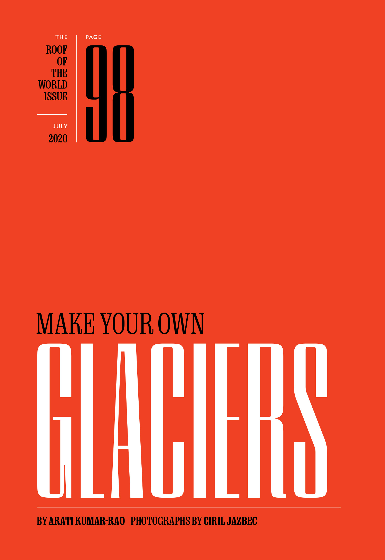
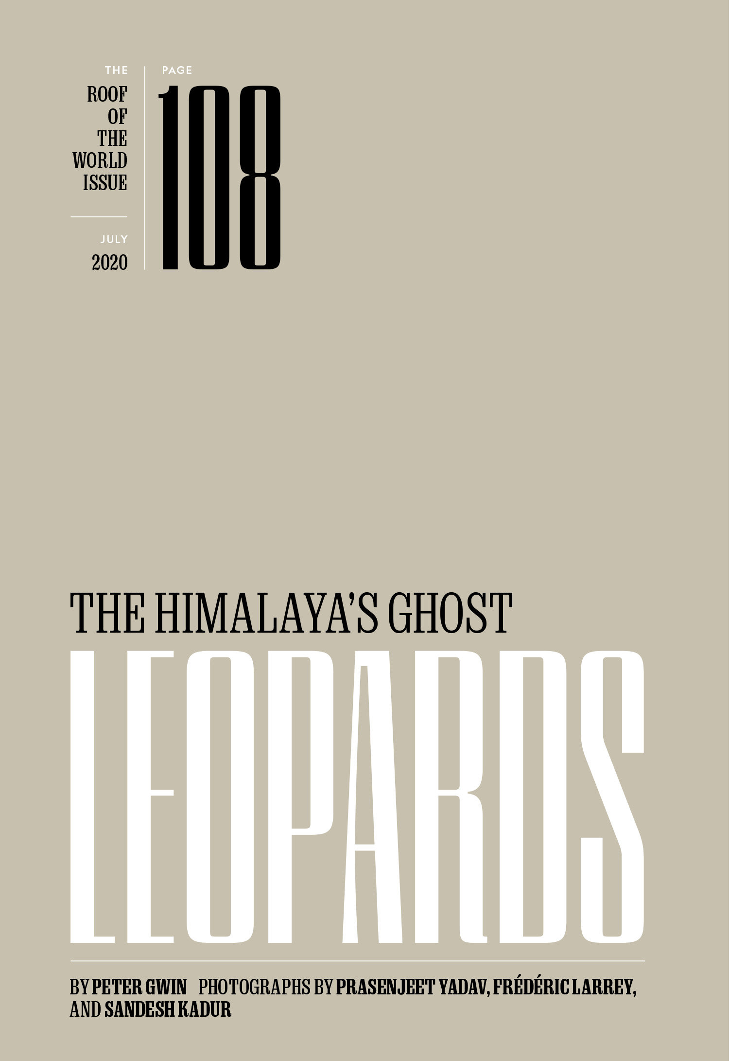
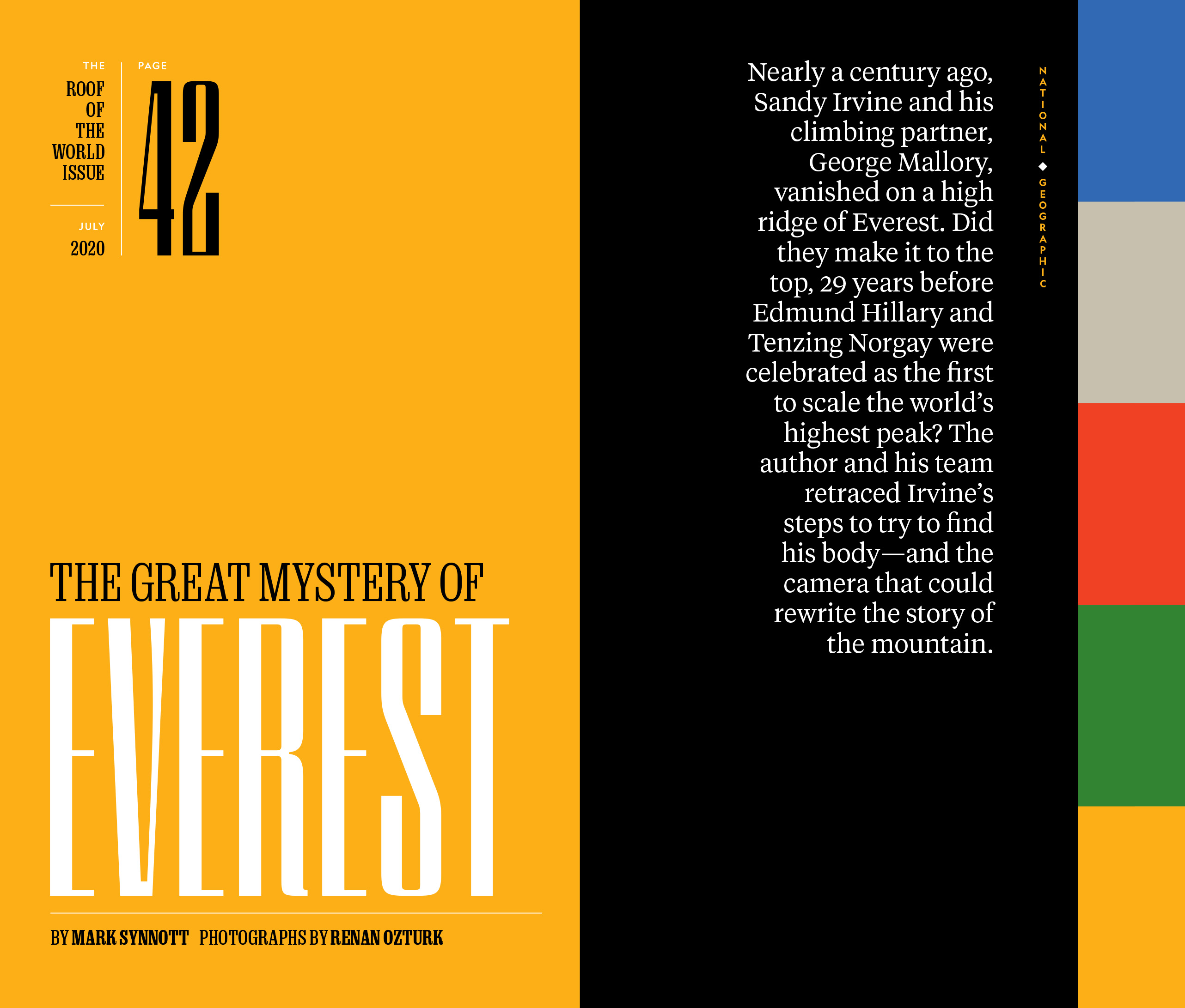
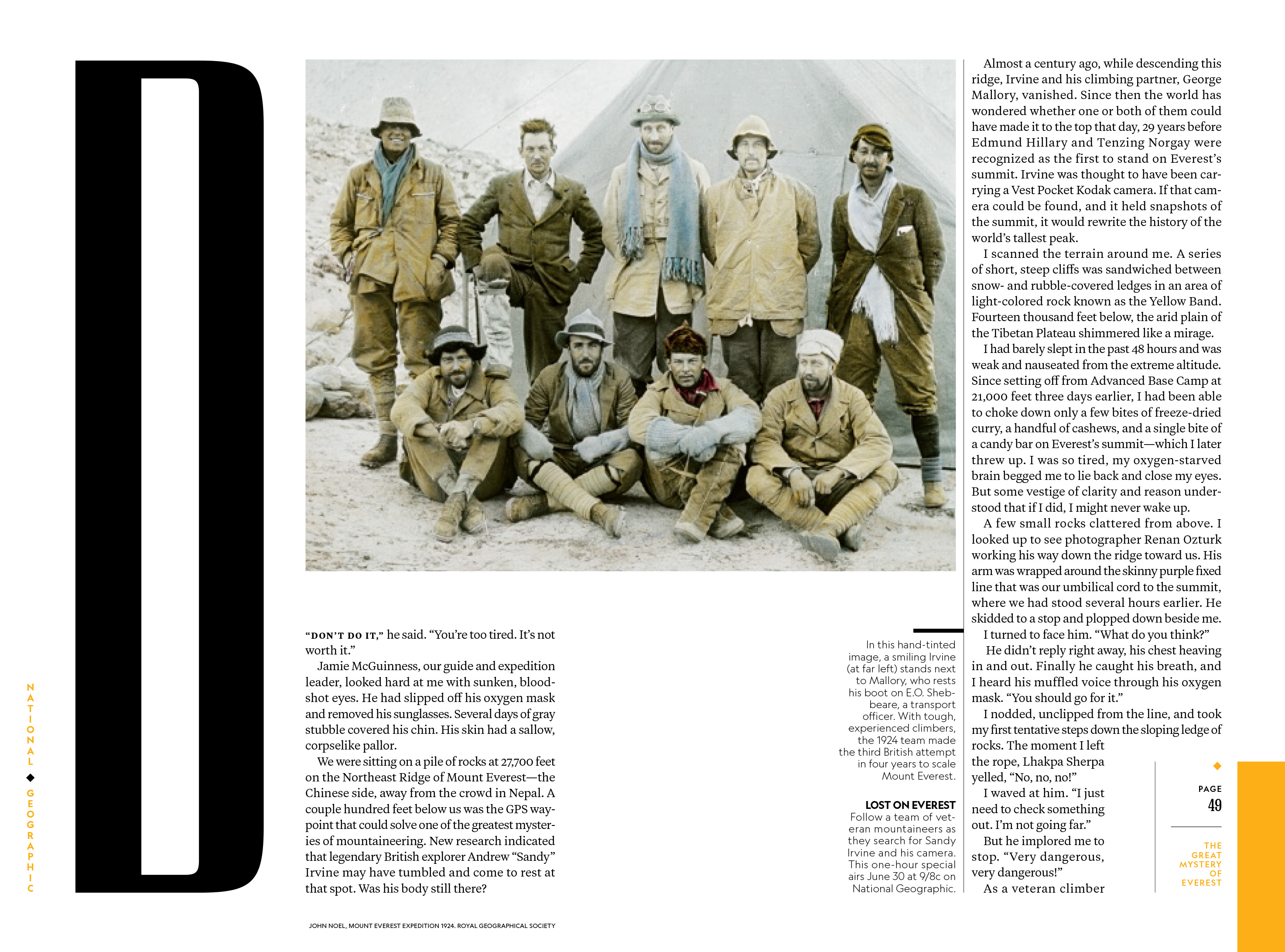
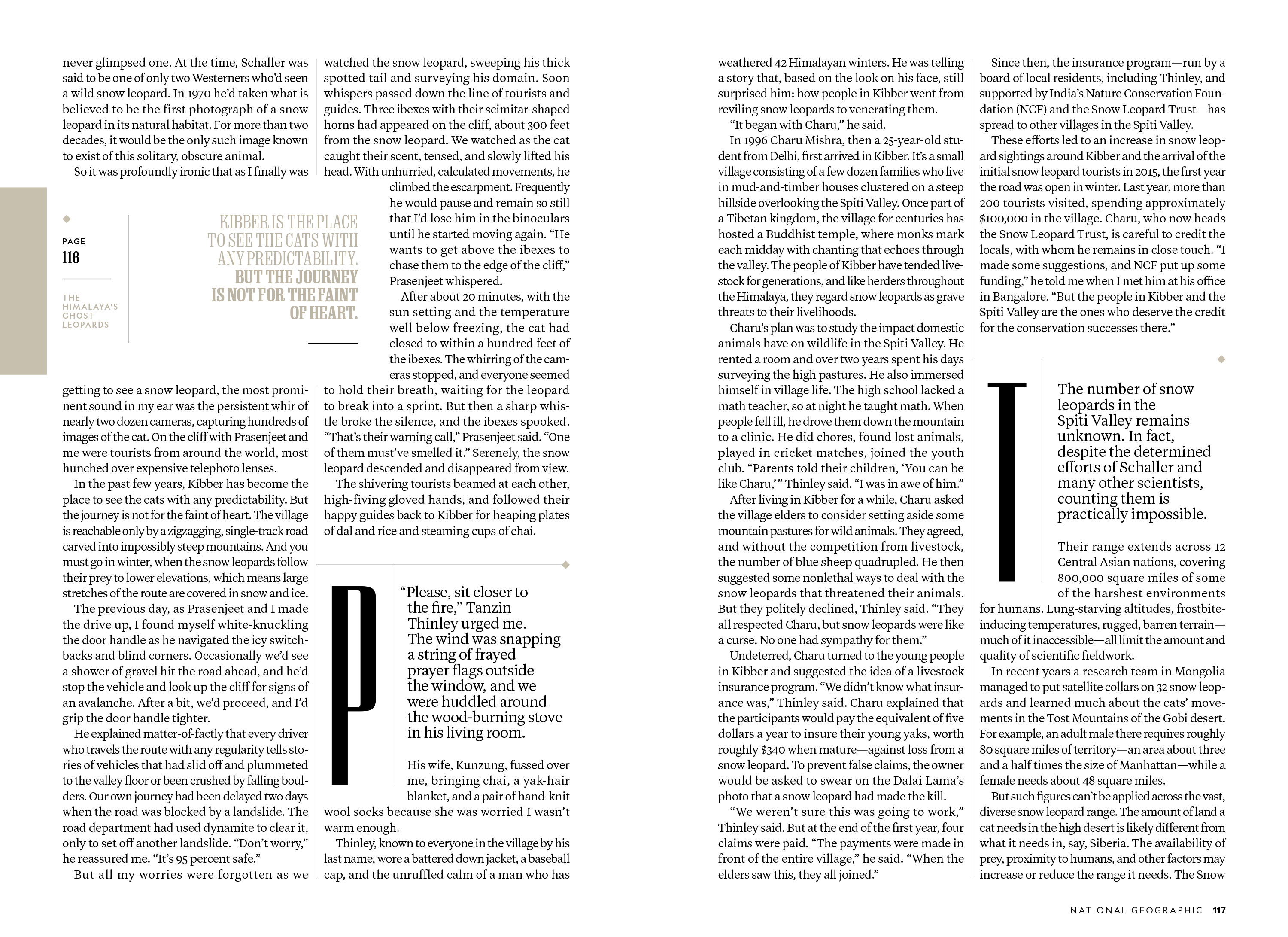
Marianne Seregi brought me in to help with the type for a special issue of National Geographic centered around a story about George Mallory and Sandy Irvine’s 1924 attempt to summit Mount Everest. She wanted a new addition to the Earle and Marden family that drew from the scale, time period and sheer audacity of Mallory and Irvine’s plans. I drew a bunch of very tall typefaces before we locked in on one that had a bit of an Art Deco feel packed into a very condensed width. I added sweeping curves to some of the thin strokes to echo the shape of the mountain and these thin strokes feel more substantial. The typeface worked very well with Earle and Marden in this issue and many that followed.
Emmet Smith reached out as the issue was closing and asked if I could help him figure out the cover design. We ended up making the type HUGE and added some serifs to improve the legibility. We revisited this style a few months later for another special issue.


