


Allie Fisher, a partner at GDP, sent me an email saying “We’re doing something with National Geographic. Can we give you a call?” I’ve done a lot of fun work with GDP and and the thought of collaborating with them on something for National Geographic was very exciting. I responded with “I’m at my desk.” My phone rang less than a minute later. They were working on a major reorganization of the magazine’s contents, a completely new design and more in preparation of the magazine’s 130th anniversary. They wanted a typographic palette with lots of personality. Would I be interested in working on some typefaces and giving the nameplate some thought? “Yes!”
GDP had compiled a research portfolio of typographic styles from the magazine’s first 130 years. They wanted me to make something inspired by two headline styles that were used in the 1970s: a condensed slab serif (Niebiolo’s Egizio Condensed) and an idiosyncratic sans serif (Photo-Lettering Inc.’s Fiedler Monogothic Condensed #6 aka FMC6).
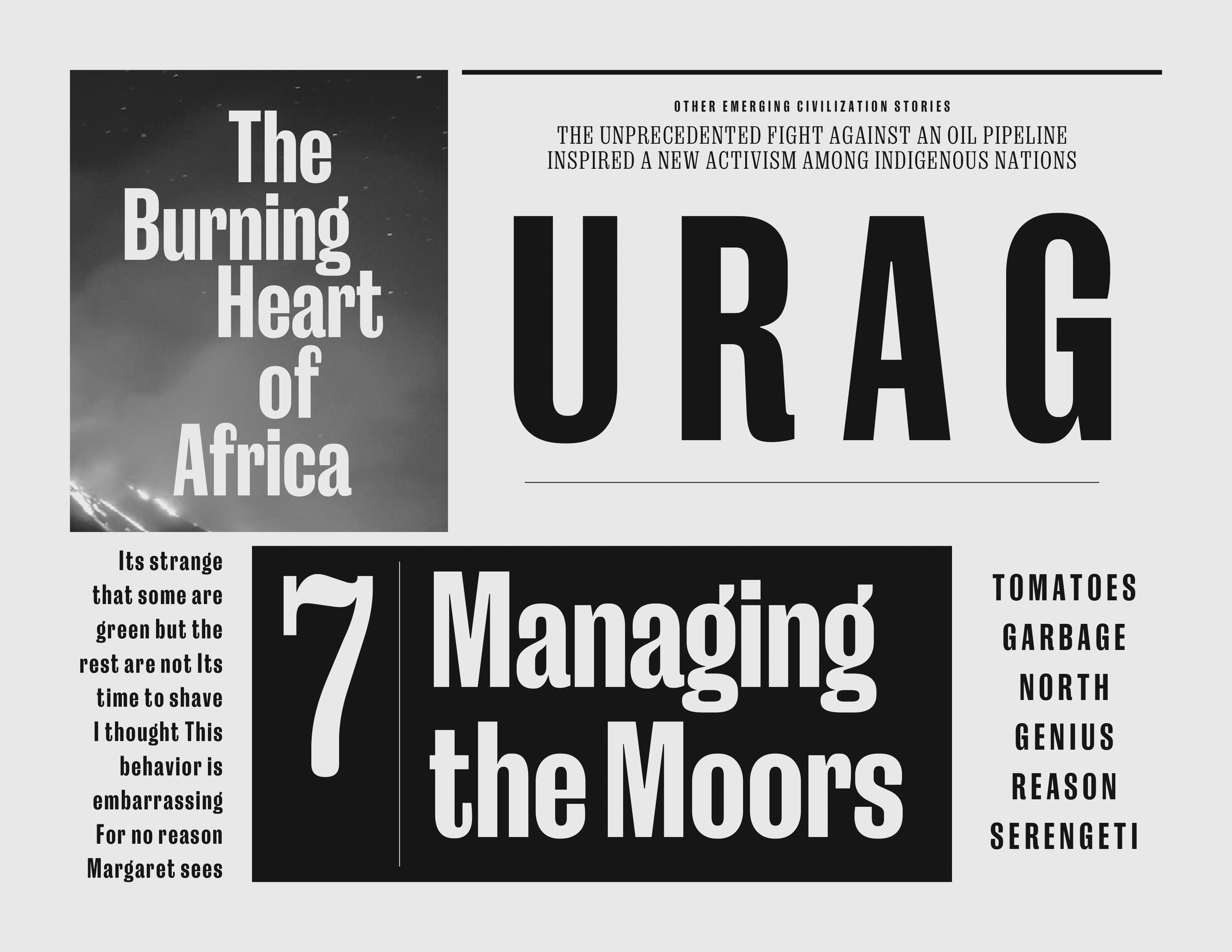
They showed me early sketches of their ideas for the magazine redesign. I was blown away. The basic building blocks of visual communication had been stripped to their essence and combined in stark ways to create something thoroughly modern. The page geometry had a beautiful simplicity. The typography was richly textured. The photography was given the white glove treatment. The hierarchy of elements was clear and unambiguous. Even though these were just sketches, I could see the potential and I was excited to be able to contribute to making it even better. These sketches used an off-the-shelf digital version of Egizio Condensed and a very condensed sans serif as stand-ins for the typefaces I was tasked with creating. This showed me exactly what my typefaces would need to do:
The sketches also showed me the exact environments in which my typefaces would be used:
The slab serif was to get the most use, so I started with that. The use of an existing version of Egizio Condensed in the layout sketches allowed me to do a deep analysis of what was and wasn’t working with the slab serif. Egizio is one of my favorite typefaces. The regular width is amazing, the italic is a masterpiece and the condensed, while quite quirky, can be very lovely in the right environments. However, in these ultra-precise layouts it just wasn’t right. In headlines the spacing was too loose, the shapes were too open, the short x-height required too much line-spacing and the not-light-but-not-bold weight was not right. In paragraph blocks the proportions were too varied, the width was slightly too narrow and the contrast impaired readability. In gigantic initial caps, the shapes lacked a certain... something. Plus, there was only one weight.
I began by drawing something from scratch that was in the same general aesthetic realm as Egizio Condensed, but addressed the problems I had noted.

I reduced the contrast, raised the x-height, unified the horizontal proportions, made it all slightly wider and so on. I sent Allie a proof along with my general thought that “It’s not working, but I have some weird ideas about how to make it better.”
Allie agreed that it wasn’t right and encouraged me to try whatever I thought would make it work, even if it meant departing from the archival reference. The gist of my weird idea was that it needed to be streamlined and the geometry needed to be caricatured. I thought this would nicely echo the overall precision of the layouts in the micro world of typography.
I wanted to work through these experiments quickly so that I could try lots of ideas. I came up with a new working method to facilitate this: I made a test document that contained all of the type usage situations from GDP’s layout sketches. Then I made a RoboFont tool that would automatically populate the changes into the test document.
This working method allowed me to very quickly try big, off-the-wall ideas, see if they worked and then try something else. I’d do something like significantly flatten vertical curves, look at the tests and decide to go forward, back or sideways. It was a very interesting way to work that led to lots of solutions that I wouldn’t have come up with using my previous working methods. I’d check in with GDP every so often and say, “This is how it looks now. I’m still thinking.” And they’d tell me, “Looks good. Keep going.” Their unequivocal trust in me to solve all of this made me push even harder.
The slab serif moved along quickly and smoothly, with a very linear development progression. The sans was the opposite of that. I started off by creating a very strict digital interpretation of FMC6. I made an in situ proofing document just like I had for the slab serif and...

This was a complete failure. It was hard to pinpoint exactly what was wrong, but I had a theory. The archival headlines had a softness to them: the corners were subtly rounded and the edges were slightly fuzzy. This, likely a side-effect of the reproduction processes of the 1970s, combined with the offbeat shapes of FMC6, made for very personable headlines. The precision of modern digital typography killed all of that. The odd shapes of the original were in my typeface, but the warmth was gone. I could have given my interpretation rounded corners, wobbly lines and so on, but this felt like a cheap trick. I showed Allie my work and told her that I thought it was an unsolvable dead end. I suggested several off-the-shelf typefaces that they could use instead of a custom drawn sans serif. She wrote back and told me that she agreed that it wasn’t working, but not to give up on the idea completely.
I went back to work on the slab serif. I felt like it was in pretty good shape, so I started adding weights. As I did that, something started to feel off in the heaviest weights. Allie figured out what it was: the face felt too soft when in use. I tinkered with some different things and finally figured out that it was the way I was handling terminals. In Egizio Condensed, these were balls with a sharp point at the connection of the curve and the terminal. In my streamlining process, I had reduced the ball to a lozenge shape that emerged smoothly out of the curve. In the lighter weights this looked good, but in the heavier weights it made everything feel a bit puffy. I tinkered some more while looking at the effects in my test document and stumbled onto sharpening one side of the terminal. It was a really subtle change in individual letters, but it made a huge difference when these repeated in words.

This immediately made it feel like a 21st interpretation of classic wood type styles. It was old but new and I was extremely excited. When I teach, I like to tell students that there is a point in the design process at which the control over the design of a typeface abruptly switches from the designer to the typeface. The typeface begins asserting its own opinions and the designer must embrace the role of outside observer. This terminal shape change was that point in this project. The samples in my tests went from looking like sketches to looking like real things. This moment was so illuminating that it also told me what to do with the sans serif: make a copy of the slab serif, slice off the serifs, reduce the contrast, condense it, flatten the sides even more, replace the rounded bits in the terminals with subtle arcs and make some slight structural changes to a few letters. Do this and I’d have a modern version of a wood type grotesque. FMC6 looks like it was inspired by Alternate Gothic which was inspired by wood type grotesques so, this was it. I stayed up really late one night making a proof of concept, sent it to Allie with a note that said, “You’ve probably moved on, but just in case you haven’t... I stumbled onto this.”
She wrote back and said, “It needs to be more condensed, but, yeah, this is it. Go!”
Everything flowed from there. I spent a few months moving points around, tweaking weights, adjusting kerning and so on. Then, it was done. We named the slab serif Earle, for famed National Geographic Explorer-In-Residence Sylvia Earle. We named the sans serif Marden, after Nation Geographic’s noted polymath Luis Marden.

The overall design launched to critical acclaim and won pretty much every industry award. I was o honored to be a part of this project.
Emmet Smith and Marianne Seregi reached out to me not long after Earle and Marden were finished and wanted to know if I had thought about making a wide version of Marden. They wanted it for a special issue they were working on. I told them that I didn’t think Marden would work wide, but I had an idea. Earle and Marden shared the same underlying structure and conceptual ideas. What if we took those underlying ideas and made a wide sans serif? I figured that it would result in something that would work well with Marden. They told me to go ahead and I made it. The typeface debuted in an issue devoted to women’s rights. We went on to make typefaces for special issues on Earth Day, outer space, exploring our oceans, saving our forests, recent discoveries about dinosaurs, the year 2020, the year 2021, health and wellness, Mount Everest and King Tut. All of these were used in other issues, giving National Geographic a very rich typographic palette.
