
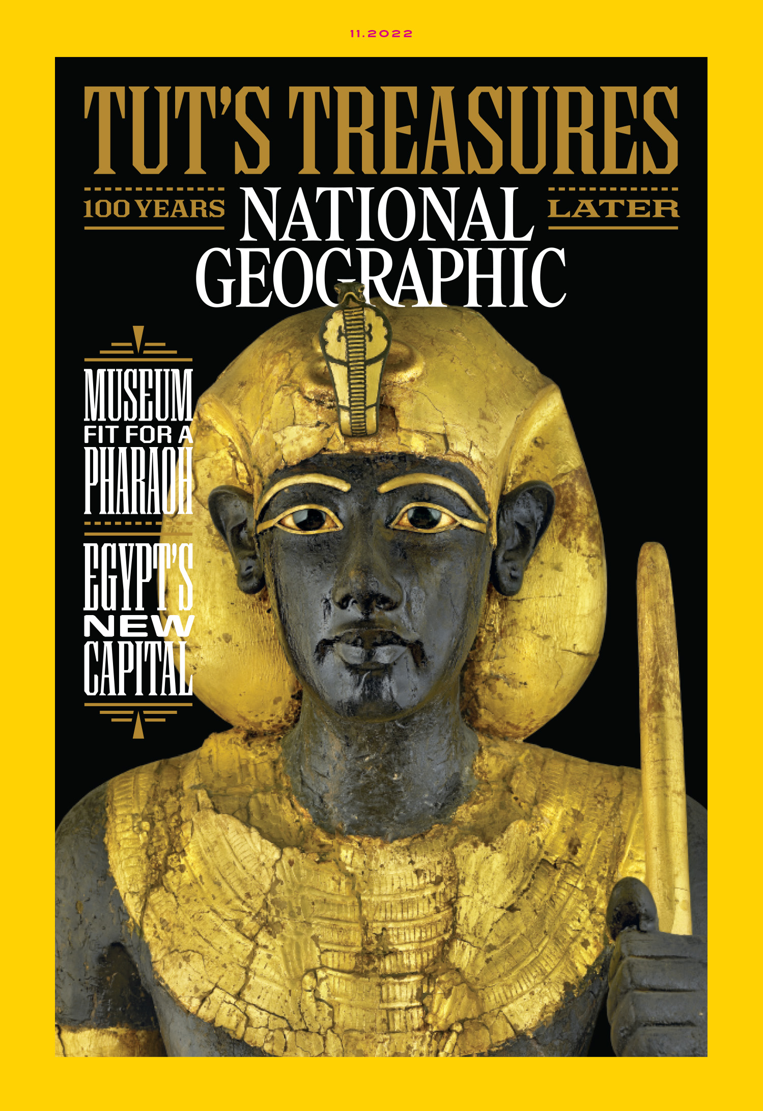
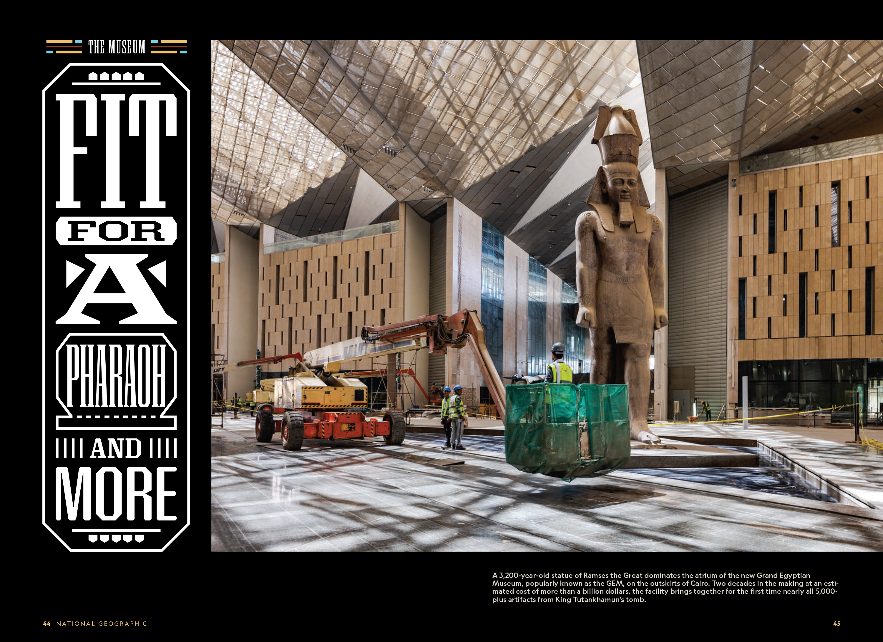
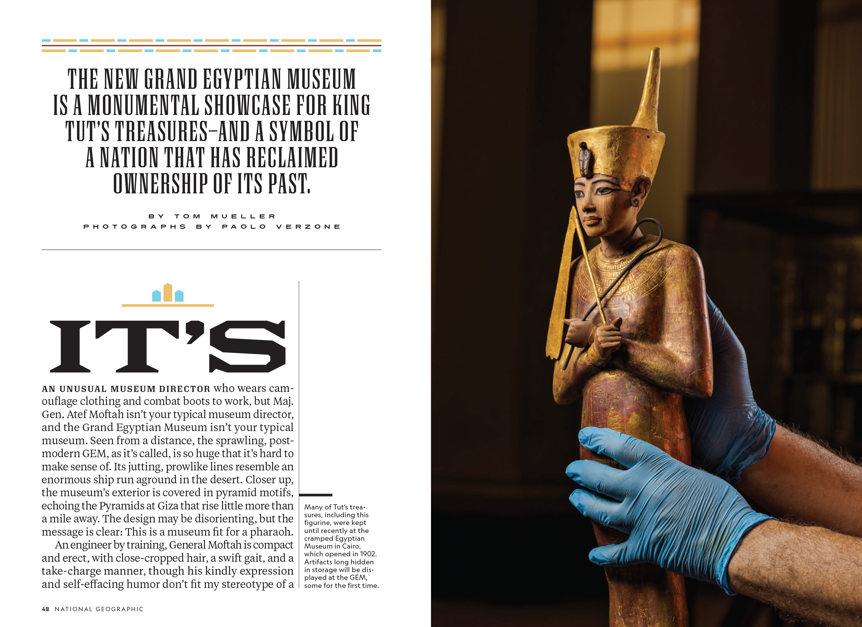
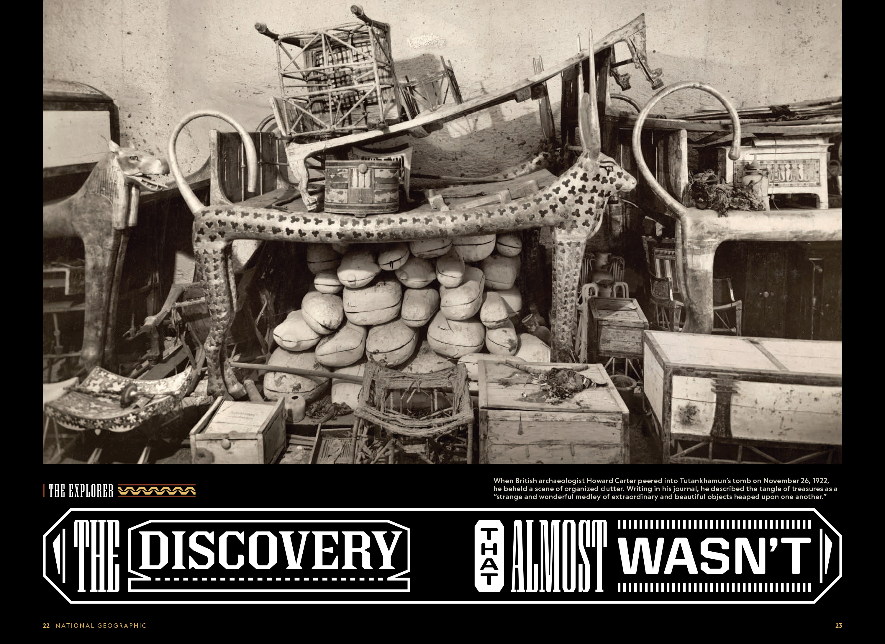
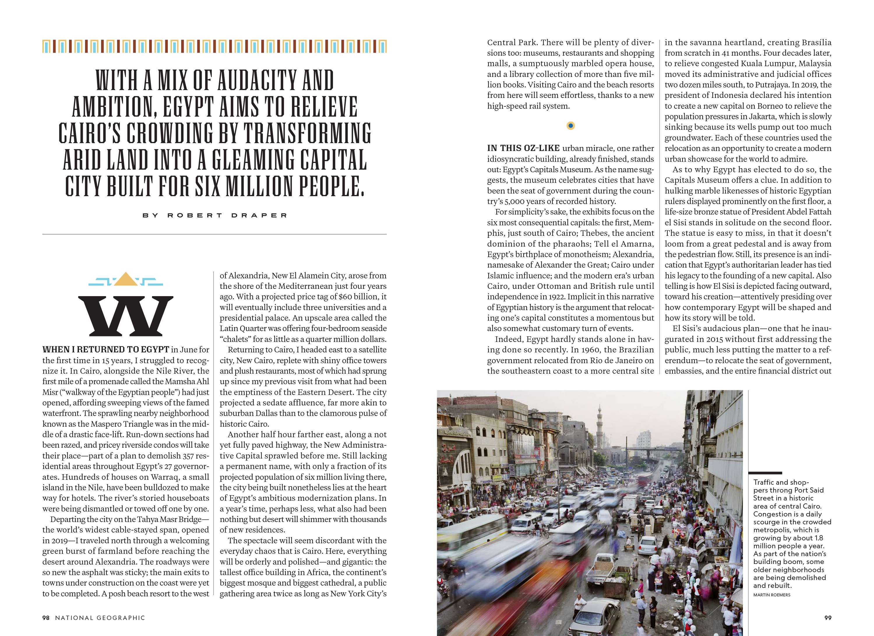
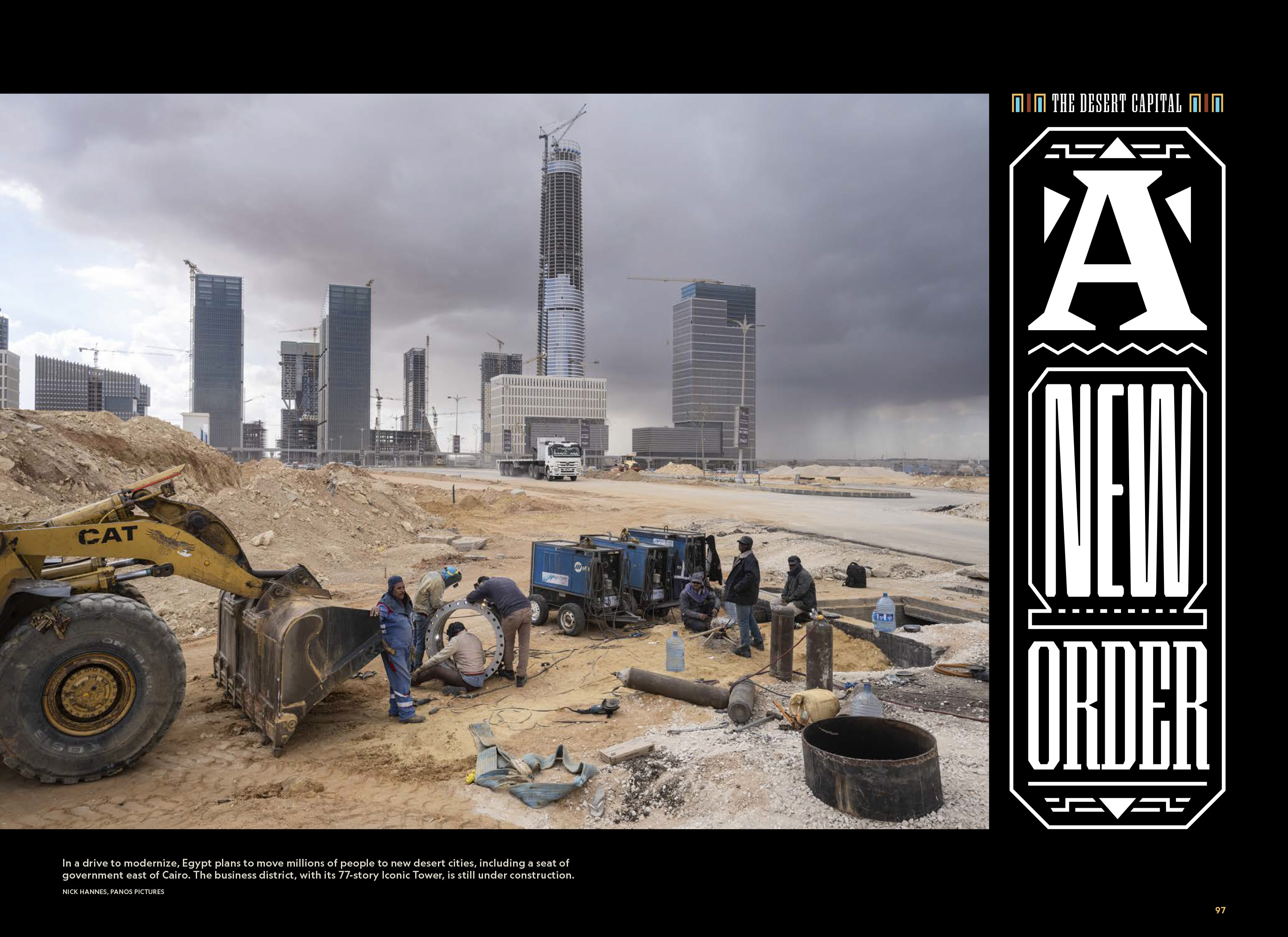

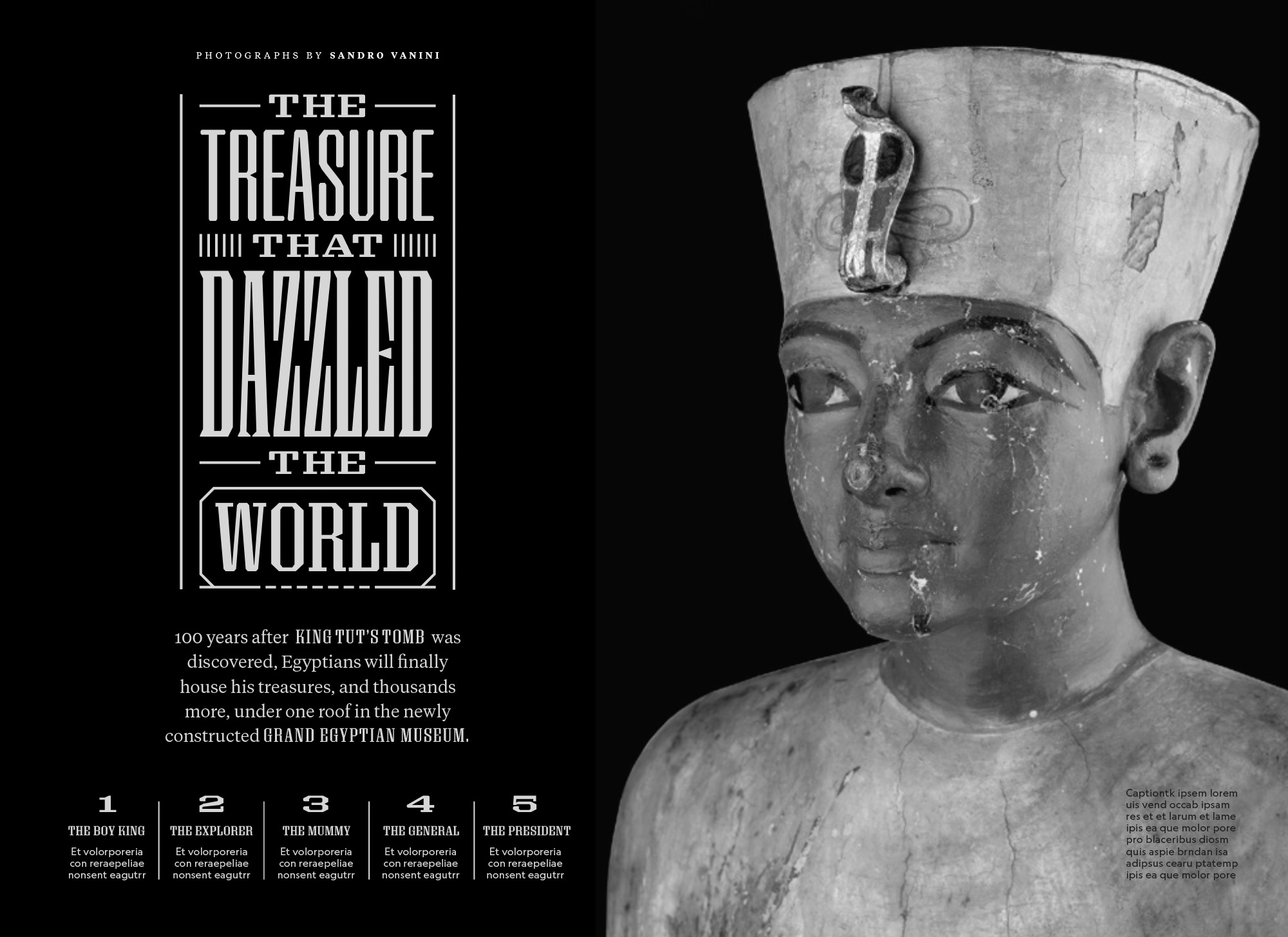
TJ Tucker asked me if I could letter headlines for a special issue of National Geographic that was focused on King Tutankhamun. He sent me some beautiful photographs that would be in the issue and said that he wanted the headlines to reflect the items in the photographs. Specifically, he wanted the lettering to somehow resemble the hieroglyphs. We had a long phone call and talked it through. It wasn’t so much the style, structure or symbolic nature of the hieroglyphs that he wanted to capture. Rather, he wanted the feel of the hieroglyphs. I told him that this would be really hard to pull off with the structure of Latin letters, but I would give it some thought. I hung up the phone and wrote down some rules:
I looked at a lot of reference images and one thing that really stood out to me was the overall texture and linear movement of hieroglyphs when seen en mass. The symbols created an organic density that reminded me of the typographic textures seen on 19th century posters printed with wood type.
The texture on the posters was a side-effect of combining numerous typefaces within a single composition. I started wondering if this texture, in combination with emphasized linearity, could achieve the feel that TJ was looking for. I made some proof of concept of headline compositions that mixed a sans serif style with a wedge serif. I thought it was interesting, but the lettering needed to be more complex. I drew a slab serif to go with the other two and sent it to TJ to see what he thought.

He was into it. However, we both felt that the lettering was too simplistic. It needed more detail to fully capture the texture. We also agreed that we would need to be very attentive to which words were given emphasis in the headlines. For example, in one of my tests I made “IN” huge. It looked cool, but it made the headline hierarchy discordant. But, the overall idea was good. Then TJ hit me with some bad news: we wouldn’t know the content of the headlines until months later, right before the issue would go to press. In other words, I was going to have to draw multiple very complex headlines without knowing the words that needed to be drawn. I told TJ that I would figure something out.
I did a lot of thinking and came up with a plan: I would draw fully functional typefaces in the slab serif, wedge serif and sans serif styles in ultra condensed and ultra extended widths. These would be compiled into variable fonts. When the final text arrived, I would use these to quickly design the structure of the headlines, I’d convert them to outlines and make adjustments as needed. This would allow me to do 90% of the drawing work ahead of time. I made a new proof of concept for TJ showing the letters ABEFGHIMNORSV in the wedge serif and composed some demo headlines.

He was into it. I got to work drawing the typefaces. TJ started giving me early layouts to draw on and the National Geographic team gave me the interim headlines to test with. I drew the letters needed for the interim headlines as soon as they arrived and would rough out compositions on top of TJ’s layouts.
We would talk about how everything was working and then I would draw more.

Then I would draw more.

Eventually I had a very flexible typographic system with which I could compose the headlines.

I was ready to build the final headlines, but I had a new problem: we still had weeks to go before we would get the text. I like to work, so I gave myself more work to do while we waited. I did more research on hieroglyphic systems. That led to new ways to emphasize and encapsulate important words within the headlines. I also started building a library of ornaments that echoed details in the photographs. TJ was showing me layouts and I offered to build these ornaments into elements that could be used outside of the headlines. Then I drew some decorative drop caps. Then I made a typeface that could be used for large callouts instead of Earle.

Then we got the final text, I built the headlines very quickly and they were approved. The whole process worked very smoothly despite all of the complexity.
One of the great things about working for National Geographic is that if you have a question about almost anything they can get you a definitive answer. They have some of the world’s leading experts in house and if they don’t know the answer to something, they know who to ask. They were extremely understanding when I expressed my concerns about being respectful to our subject matter and they used their network of experts on my behalf. I was given some incredibly helpful feedback by an array of really smart folks. At one point, the team reached out to one of the leading experts in the field and I was told that this expert “heaped praise” on the work and said that they thought it had the makings of a “National Geographic classic.”