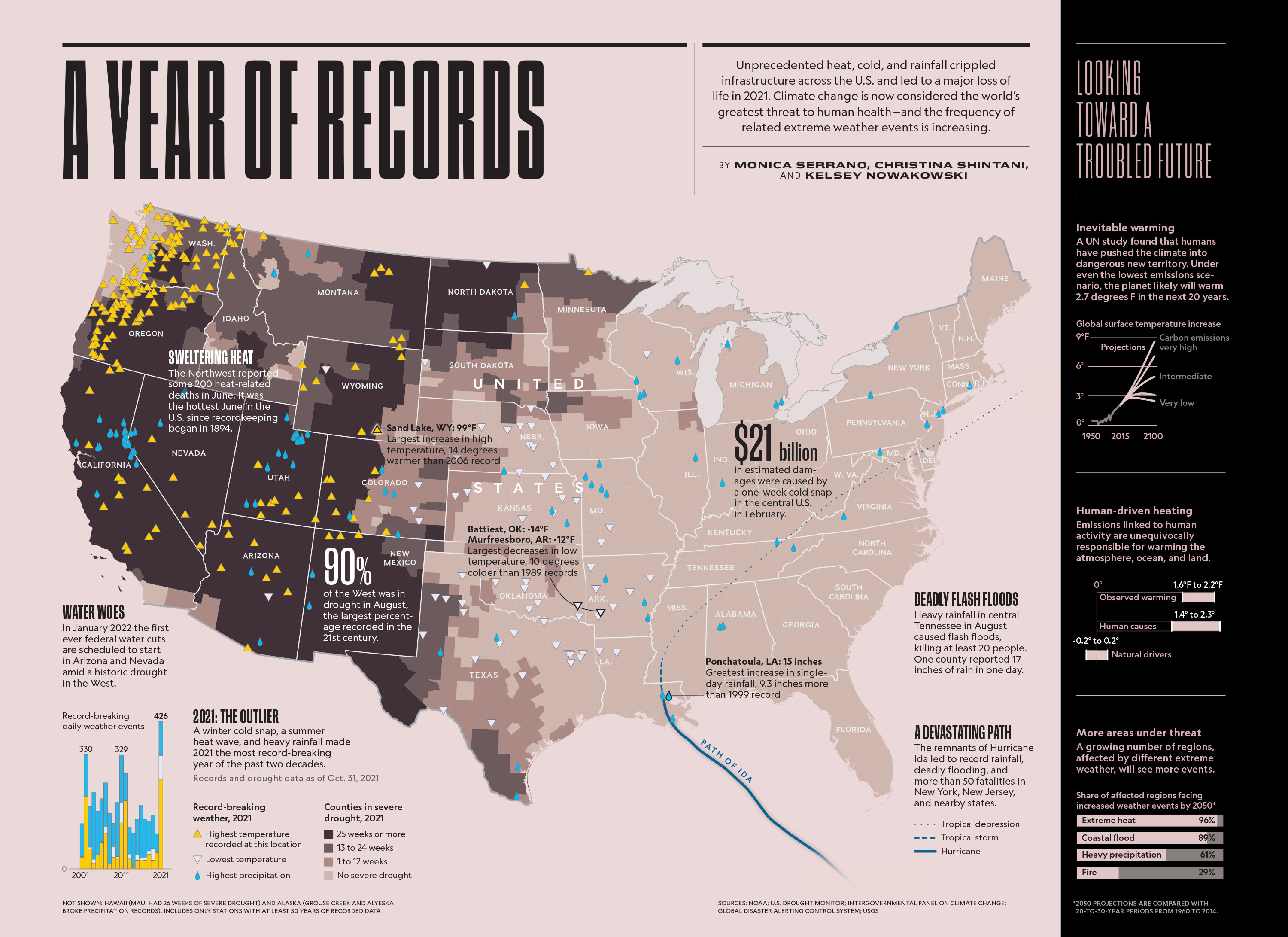
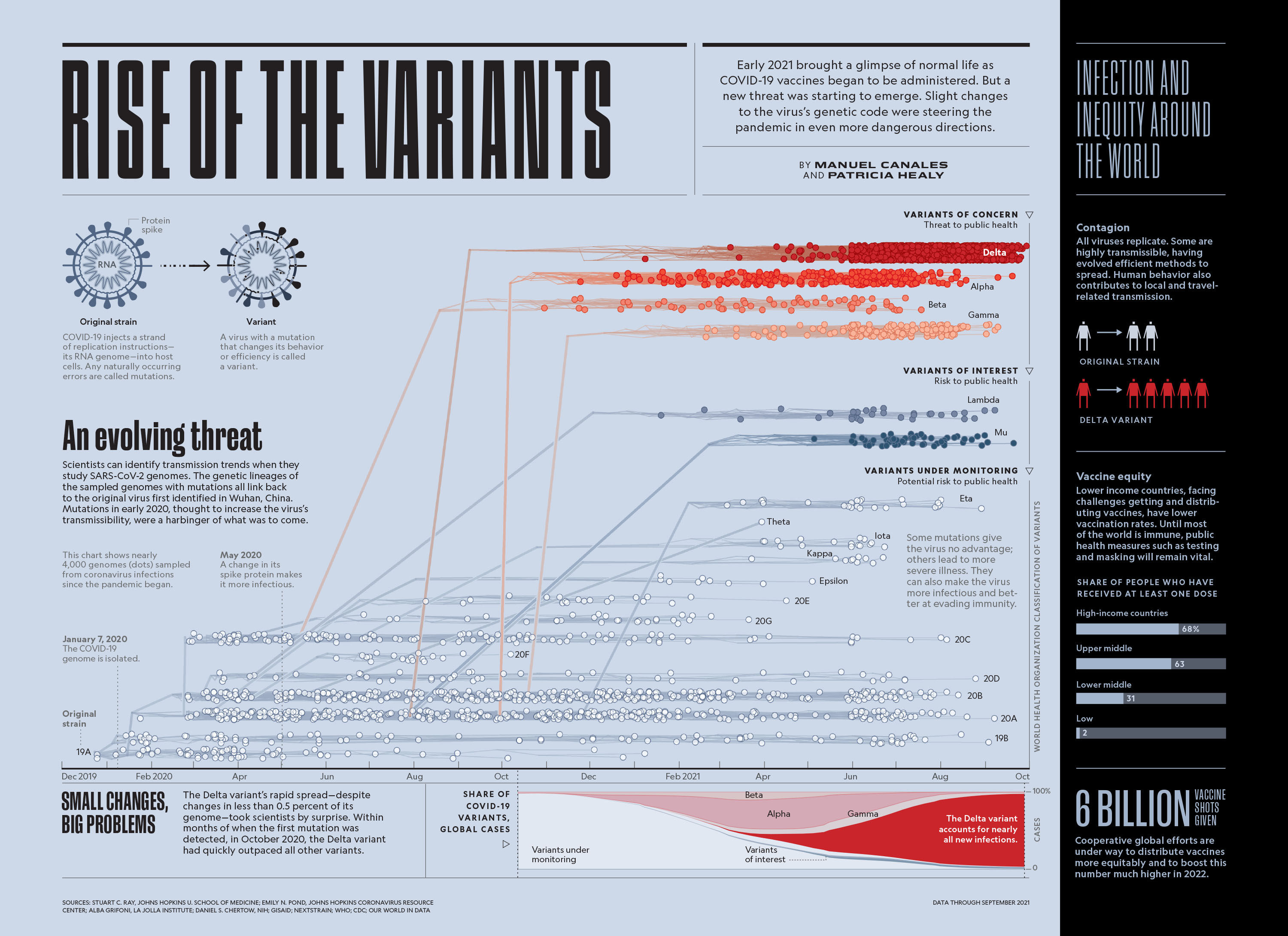
Hannah Tak was working on a special issue of National Geographic that would show significant photographs from the year 2021. She was using their Earth Day typeface and asked if I could tweak a few letters for use at very large sizes. She sent me the early layout of the magazine to show the context. Her designs gave me some ideas for a new typeface, we discussed this and I quickly drew a completely new typeface to match her work. The bold geometry in Hannah’s layouts called for a typeface with limited curves and extreme linear construction. The result echoed the overall geometry of the issue and created a striking contrast with Earle and Marden.