

Upstatement asked me if I’d be interested in designing a new logotype for Grist. Grist is really cool because since 1999 they have... well, in their words:
Grist is a nonprofit, independent media organization dedicated to telling stories of climate solutions and a just future. Our goal is to use the power of storytelling to illuminate the way toward a better world, inspire millions of people to walk that path with us, and show that the time for action is now.
Yeah, I was totally interested. Upstatement had done an intensive amount of incredible research and thinking and gave me a wonderfully thorough brief. (Read their case study!) My role in the project was to create a logotype that:
I had already done several projects with Upstatement, so I had a hunch about what they were looking for. Each of my clients have different tastes and I see my job as half clarifying/amplifying those tastes and half introducing new, complementary ideas informed by my years of experience. Upstatement gravitates towards classical letterform shapes that have been reinterpreted through a modern point of view unencumbered by the limitations of the letterforms’ original production methods. I noted that the G would be the most prominent part of the logotype and, in all likelihood, it would be the social media profile image for Grist. So, I set out to draw a whole bunch of Gs in classical, but updated, styles.
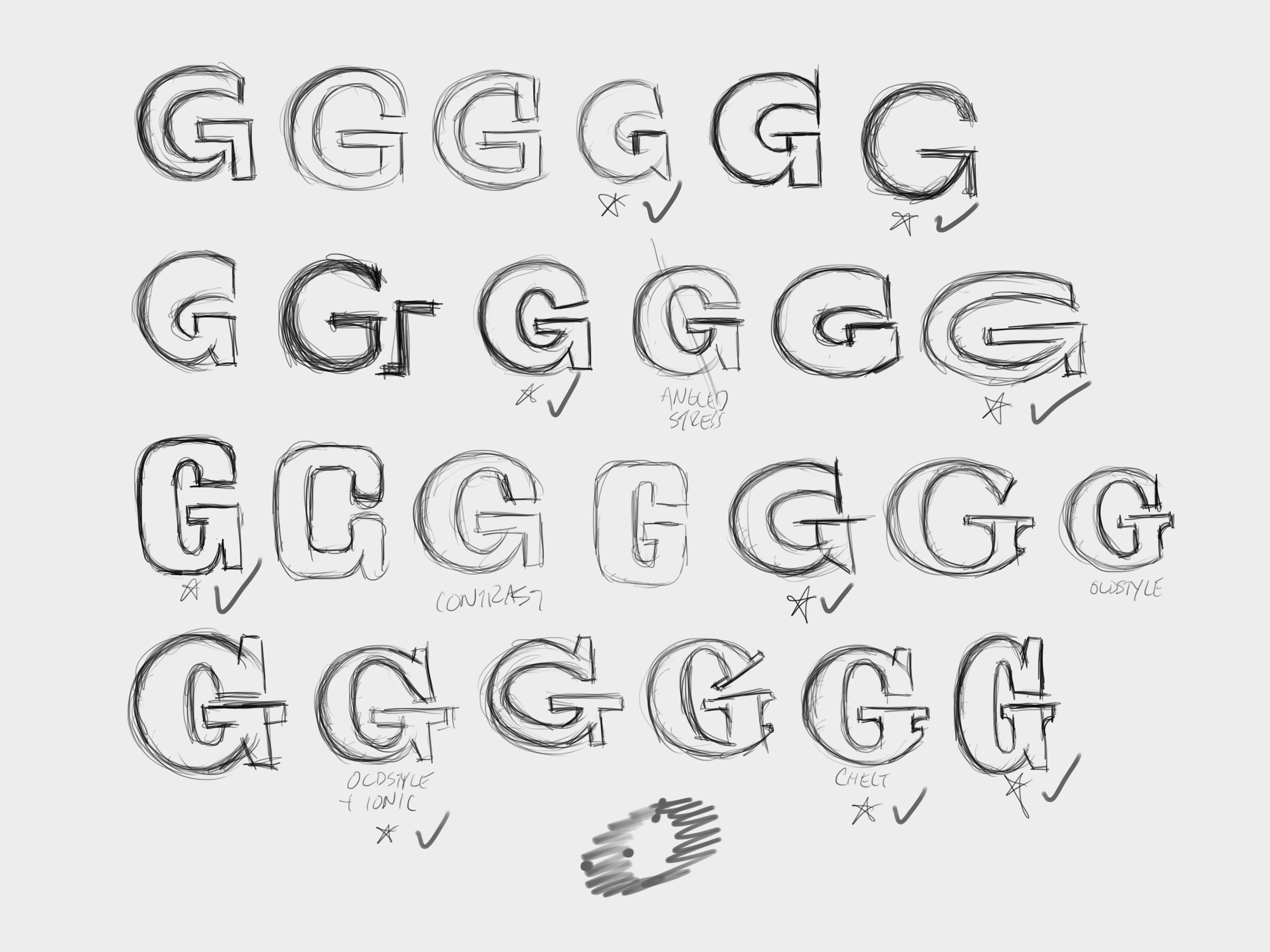
My first pass was done very quickly and roughly, just for my own review. These aren’t complete ideas on their, they are more like attributes that can be combined into bigger ideas. I narrowed my sketches down, redrew them in RoboFont and refined them to a presentable state. I showed the result to Upstatement and asked them to think with their gut about which ones felt right even if they did not necessarily look right.

They narrowed it down to six, but were really drawn to a strange one. It was a quick doodle I made in response to a “possibly use collage as part of the storytelling” note in the brief. My thought was, “Hey, what if I collage together part of a sans and part of a serif and make it clear that they are very different from each other?” Their strong response to that one made me pretty sure that was going to be the winner, but I drew full logotypes for all six choices.

They immediately picked the one I thought they would go for, but:
So, I spent several days redrawing the s and then drew a bunch of weight variations.

The final was a few tweaks away but I was worried that this thing would be cancelled at the last minute. It was a huge departure from the logotype that Grist had been using for over a decade and that level of change tends to make a lot organizations really nervous. Grist stuck to their choice and courageously sent it out into the world where it has branded their outstanding work since 2020.