Wired Headlines

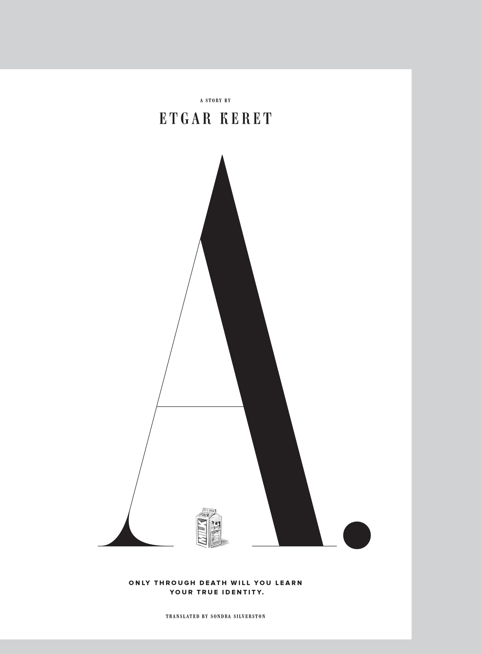
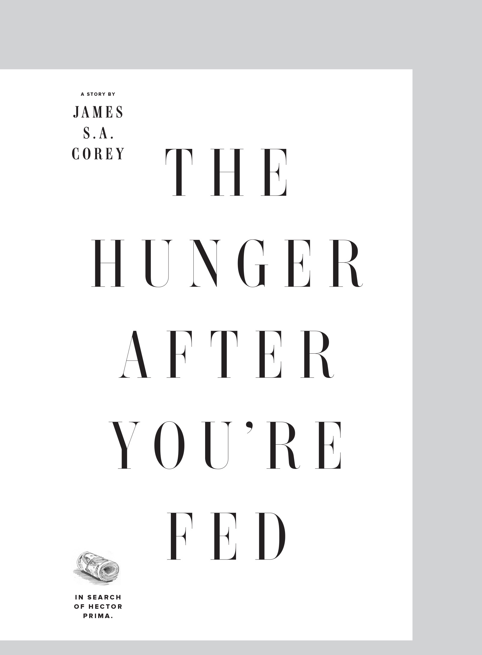
Every now and then, Billy Sorrentino and company at Wired have me draw a fancy headline for the magazine. I usually draw some sort of modern Didot style letters because, well, that style is awesome.

One of the earliest things that I drew was some lettering for their big interview with Edward Snowden. The magazine uses Jean François Porchez’s lovely Ambroise, so I drew this to harmonize with that family.

Snowden Lettering

(By the way, no, I did not know that I was drawing lettering for a story about Edward Snowden. All I was given was the text for the headline and a basic page layout. I found out the subject of the article at the same time as the rest of the world.)

I later drew lettering for the cover of their Design Issue. It was printed in black on metallic ink and deliberately, partially obscured by some fluorescent orange blocks.

The Design Issue

They had their first “sex issue” in March of 2015 and they wanted a lot of headlines in a hyper-compressed version of this Didot style. So, I made a quick typeface that they could use throughout the issue. One headline was set around 580 pt (really!) so I drew a custom, preposterously delicate version of the typeface for just that headline. I’m a bashful guy, so that’s all I’ll say about this particular set of headlines.

Sex Now Lettering

These projects are a lot of fun!


Commissioned Work